HOPES AND DREAMS BECOME REALITY

SA’ILI LE ALA DISCOVERY SPRINT EXHIBITION

Communication Design Capstone Project

The Sa’ili le ala Discovery sprints was a program Swinburne University organised and ran which was funded by the Australian Federal Government’s Safer Community Funds, where youths of Pasifika backgrounds come to Swinburne’s Hawthorn campus to complete three, four-day design and animation sprints across the year culminating with the exhibition and a mini graduation.  

My role in the exhibition creation was to create the branding and visual language to apply onto information posters on the day of the exhibition. Other collateral was to be digitally mocked up after the exhibition.

CREATING THE IDENTITY

“SA’ILI LE ALA” (meaning discovery sprints) is a mouthful as it is one word pronounced in four syllables, so the identity needed to be simple whilst reflecting on the embodiment of what the Discovery Sprints was founded on. I also needed to consider the students I worked with, being bold and colourful characters as the exhibition is the celebration of all their good work and achievements completed across the year.  

VISUAL LANGUAGE

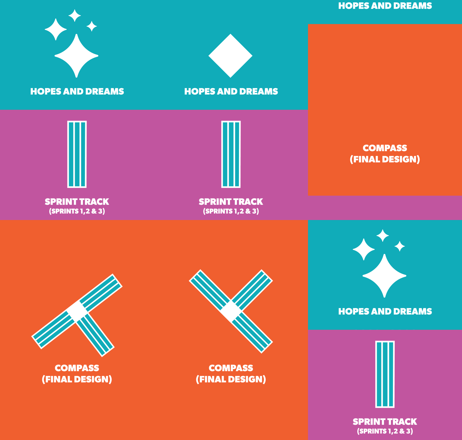
The final visual language focused on two elements. The three sprints and the students hopes and dreams being the recurring theme and part of the client’s brief. I was able to turn the three sprints over the year into a sprint track (3 lanes for each sprint) along with a diamond from the stars in the night sky to represent their hopes and dreams combining them to create a compass that, would rotate 45 degrees only.

This would be their compass to a good and prosperous future to move away from the negative risk factors in their community.  

STACKING THE LOGO

Four different variations of the final logo were needed. It was important to include a very light sea green for the ocean and white to represent sand of the beach to represent the oceans and beaches back home as most of the students migrated to Australia.

The last 2 colours of purple and orange would be inspired by the final designs of the balls and jerseys that have been printed. These colours had to be striking but balanced with each other to represent the students being bold and fun.

COLOURS OF SA’ILI LE ALA

THE EXHIBITION,
SWINBURNE UNIVERSITY

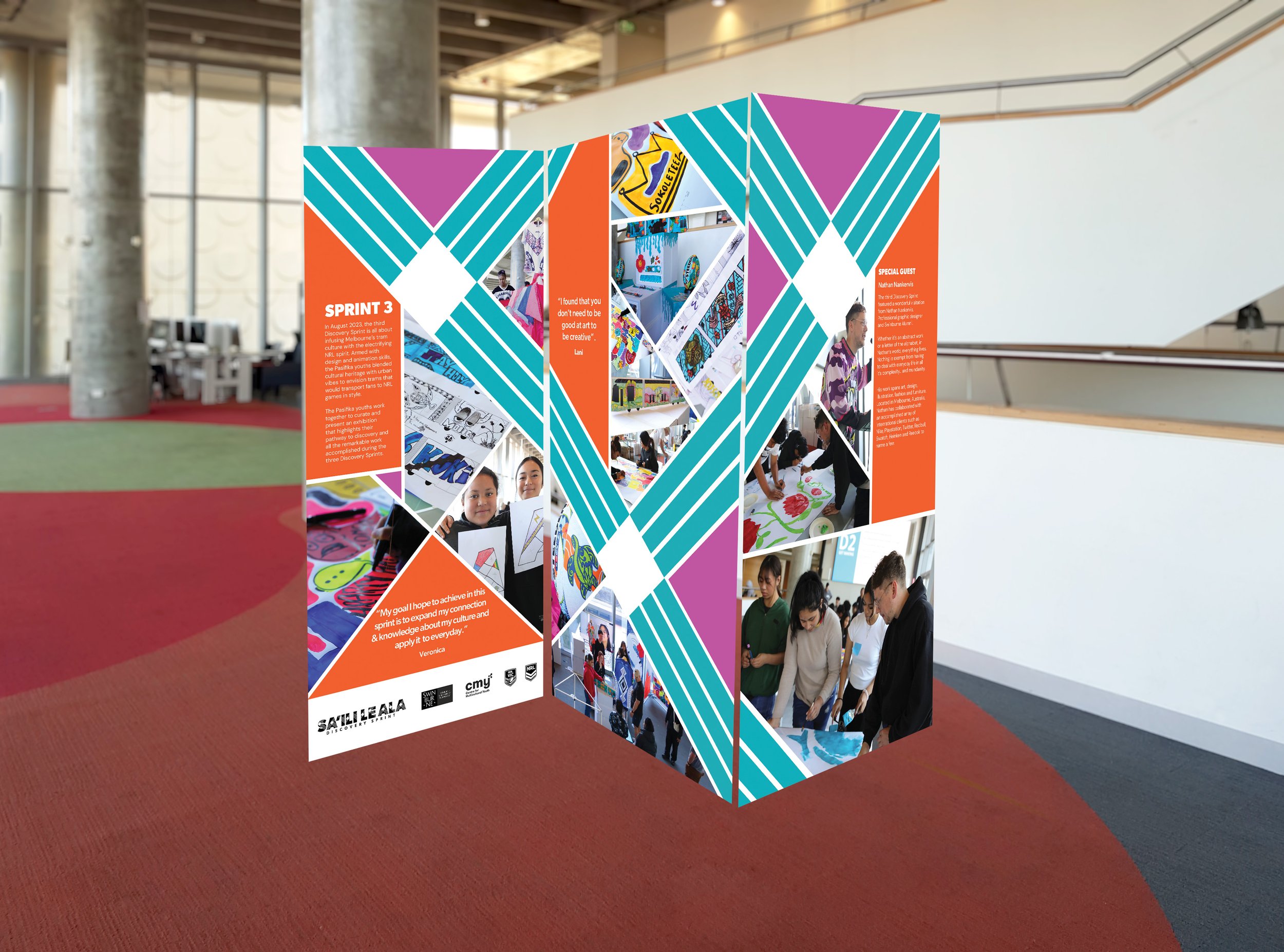
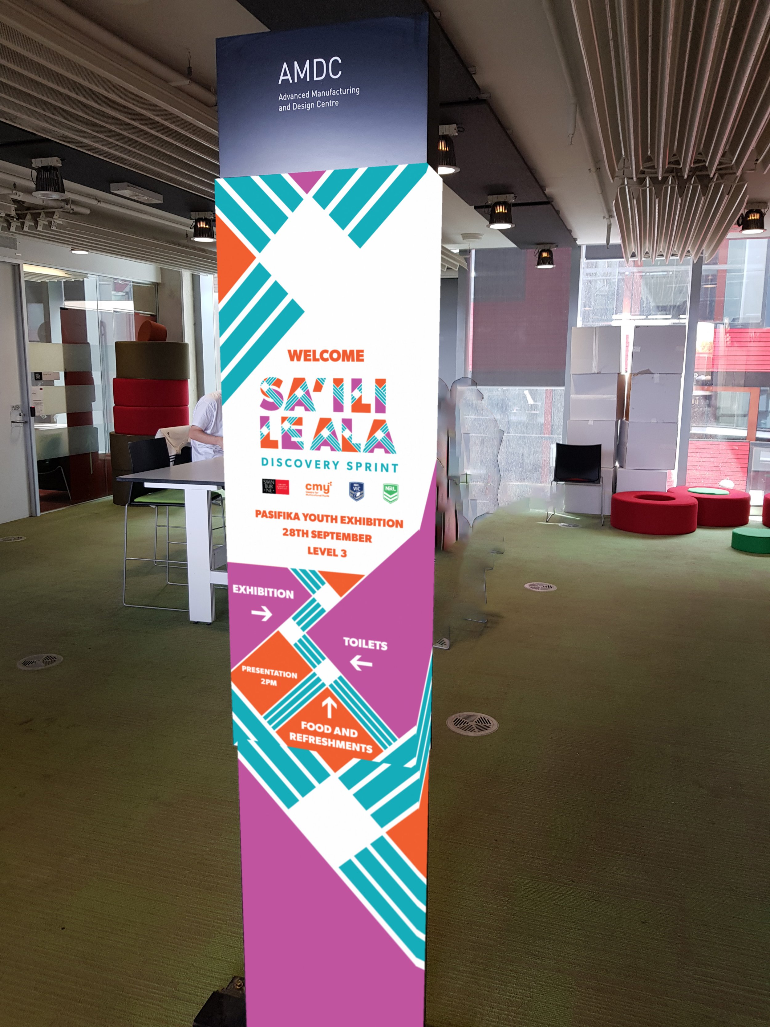
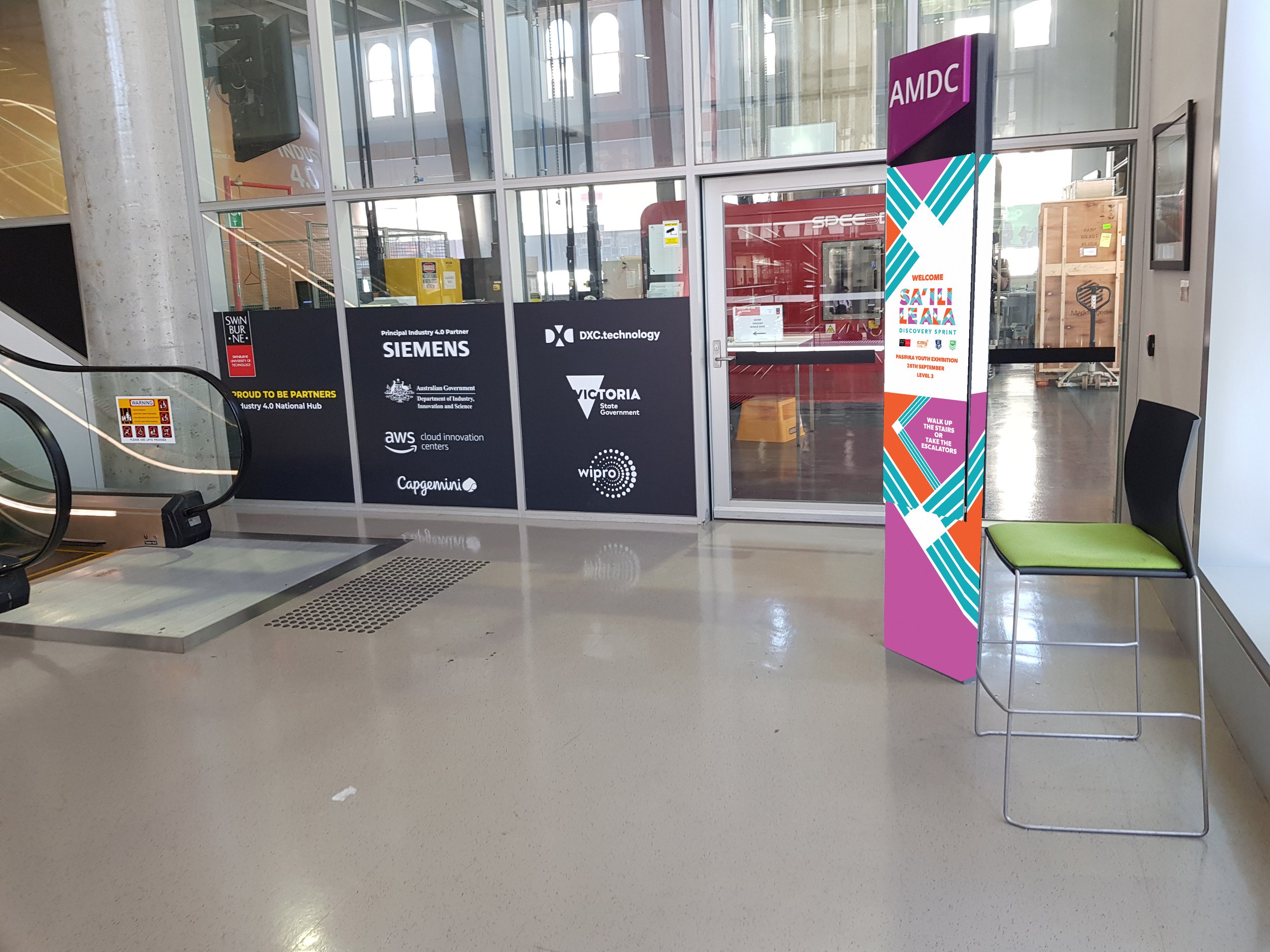
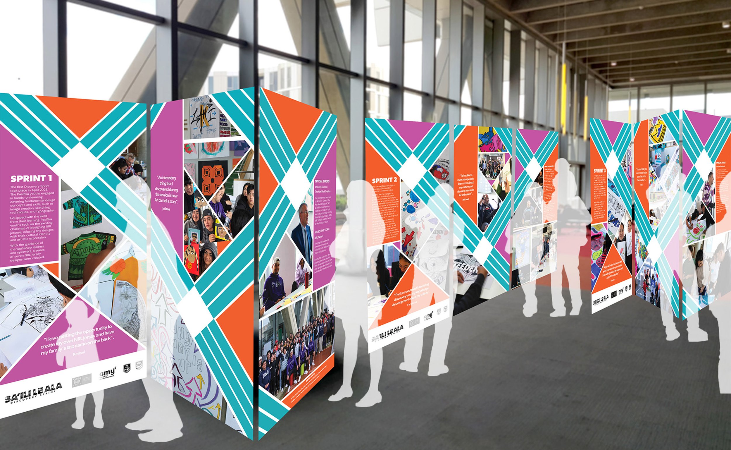
Information posters were created and printed along with the simple way finding for the families to navigate their way to the exhibition and view their children’s work. Nine posters were printed in large format to be attached on each side of 3 metal triangles. The visual language on each poster for the 3 triangles were designed to wrap around to connect.

These deliverables were created to help the parents and families understand what their child created during the three sprints showing their children’s potential as they are considered last in their community.

FINAL DELIVERABLES

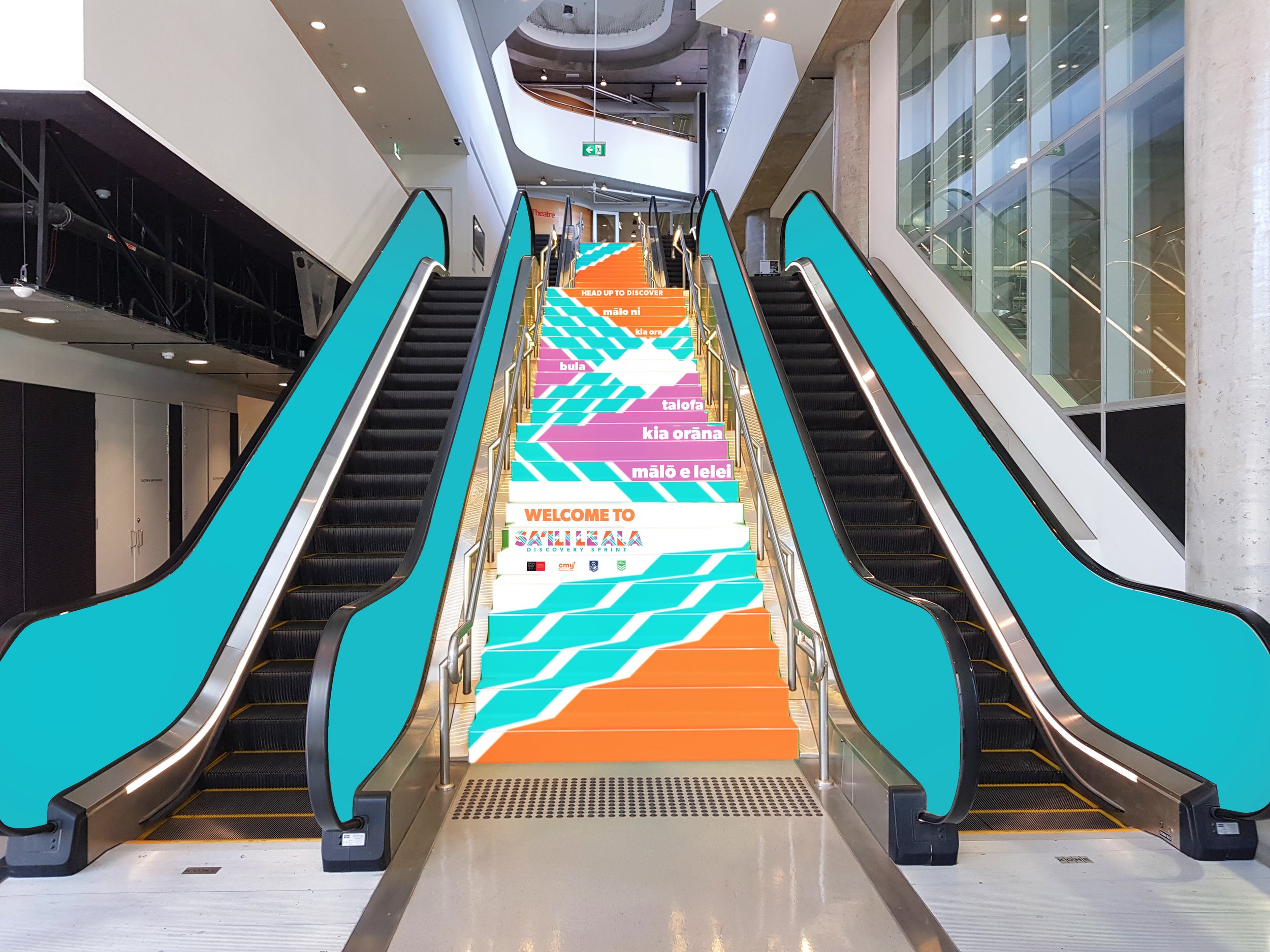
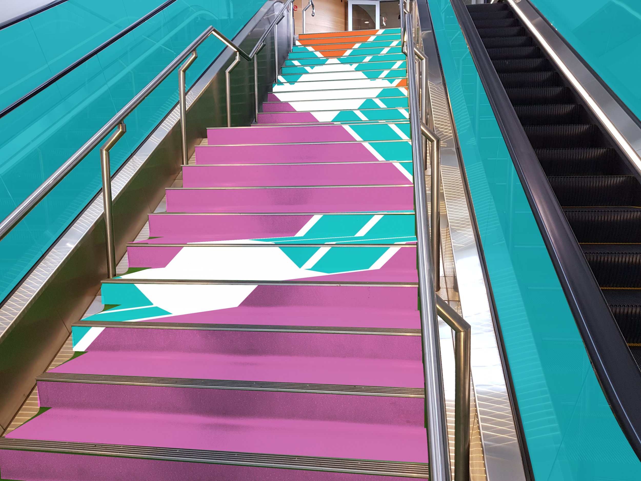
A few things were left out due to time restrictions and the constant changing schedule and deliverables list leading up to the exhibition. Digital versions of collateral were created ranging from information brochures to wayfinding on the plinths (directory) of the host building where the exhibition was held. These mock-ups were created to see how I could enhance exhibition enhance the communication design.