
EXHIBITION BRAND IDENTITY
EXHIBITION
IDENTITY
Role
Scope
Media
Graphic Designer
Clients
SUT, NRL VIC, NRL, CMY
Brand Identity,
Communication Design
Discovery Sprints Website
TOOLS


CLIENT GOAL
Create and apply an Identity -
The theme is ‘Hope and Dreams’.
OUTCOMES
1x
Brand Identity
9x
Information Posters
CLIENT GOAL
The Discovery Sprints didnt have a brand identity for the program and needed one for the opening of their public exhibition.
CORE ISSUE (WHY?)
A proper brand wasn’t developed.
AUDIENCE
Pasifika Youths, their families and
public visitors on campus.
OBJECTIVE
Create the Brand Identity for
the Exhibition.
Apply the
Brand to
Touchpoints
Create
Cohesive
Exhibition
01

Exhibition Brand Identity
CLIENT BRIEFING
Audience Insight and Solution
Solution

Insights

Create the Brand Identity for the Exhibition

Audience Insights
The Brief
HOPES
AND
DREAMS
Key ideas for the
exhibition theme identity of
“Hopes and Dreams”
Quote of the Project
“Think like
the Participants”
Clue:
Symbols = Visual Language
Potential Idea:
VISUAL LANGUAGE
INSIDE THE
BRAND LETTERS
Solution
THE
VISUAL
LANGUAGE
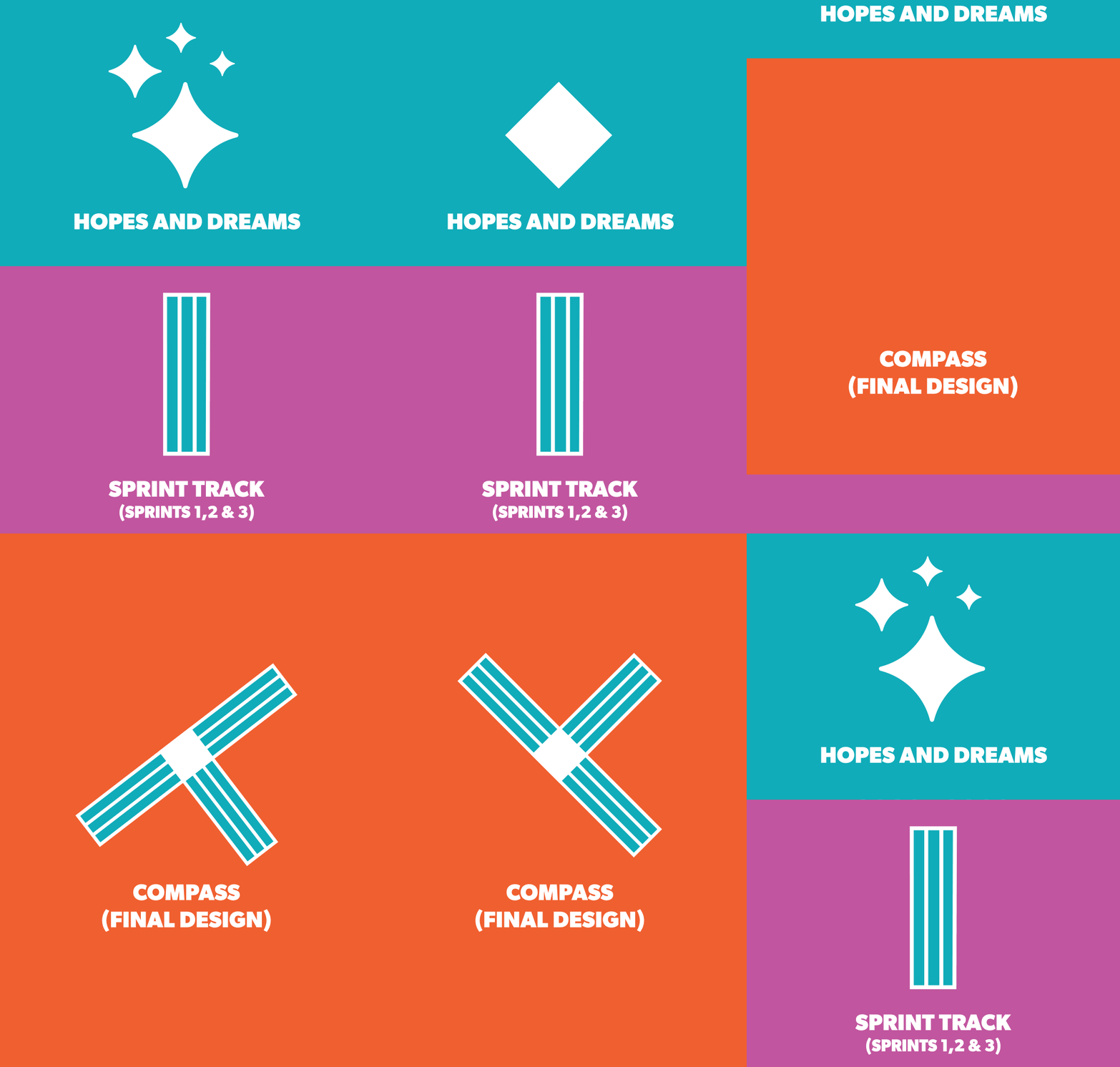
A compass to guide their future
which represents the students
“Hopes and Dreams”.
Pasifika
Stars
Pathways
Spotlight
Sprint Lanes
02
Exhibition Brand Identity
PRODUCTION
Identity Ideation and Tools
Tools

Ideation

Create the Brand Identity for the Exhibition

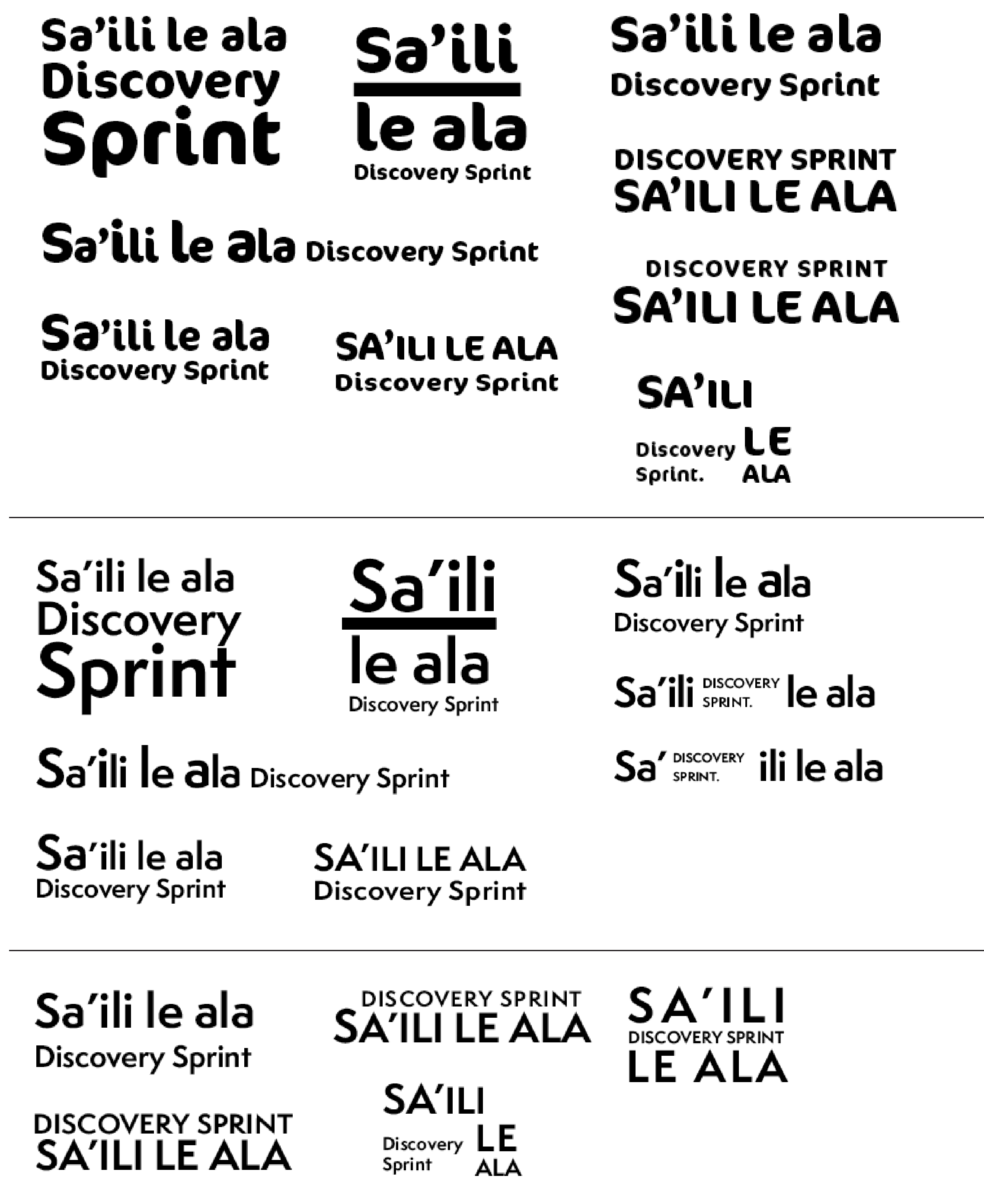
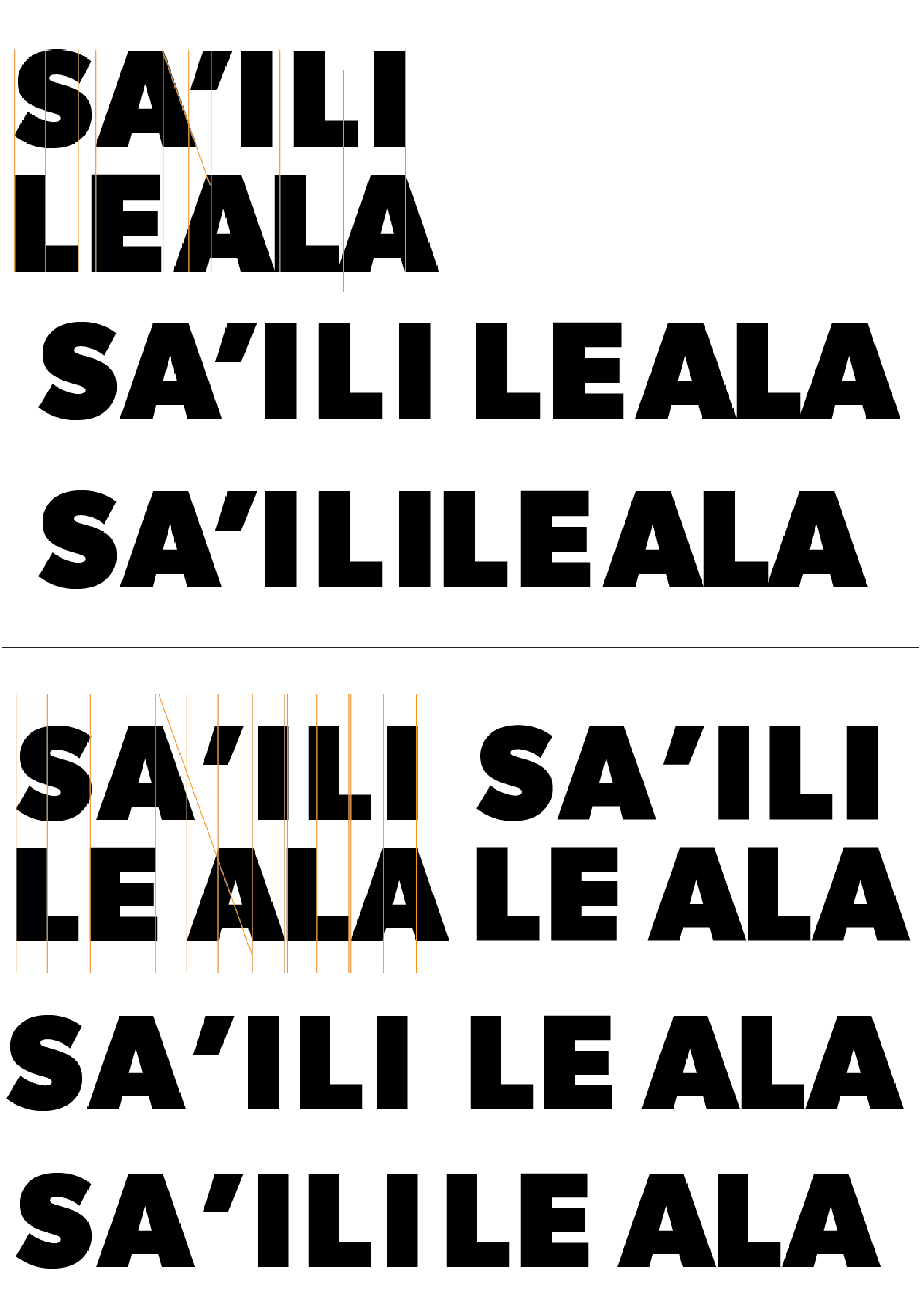
01 Brand Direction
FOCUS:
TYPESETTING
Hard to read
Too much kerning
Not too much space
Big gaps
Focus on “Sa” + “Ili
Improve spacing
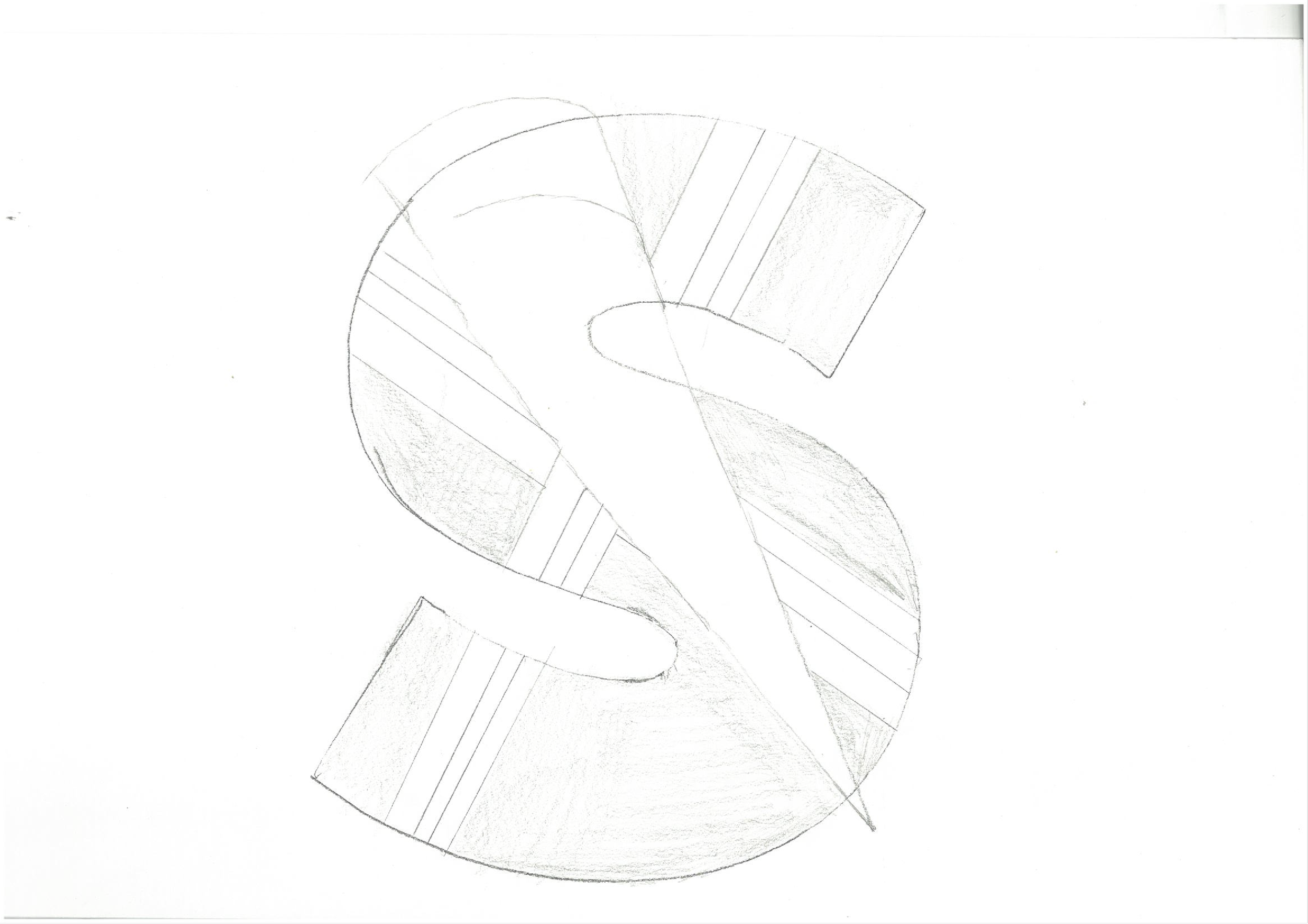
02 Brand Direction
FOCUS:
PASIFIKA IDENTITY
Still hard to read
Remove stairs
Too remove
Keep the sprint track
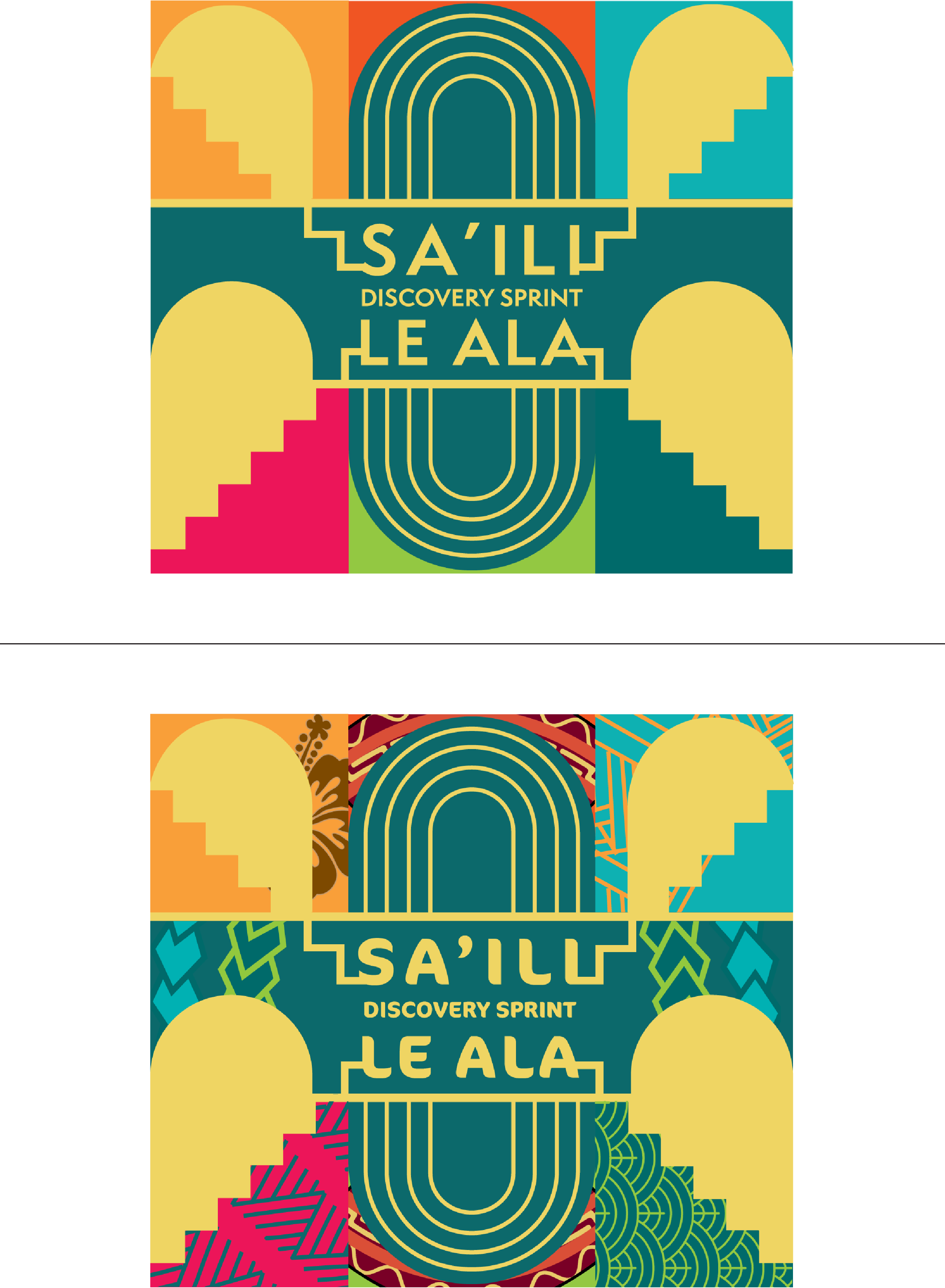
03 Brand Direction
FOCUS:
TRACING METHOD
Now refine the visual language
New Method: Tracing
Visual language included
Interchangeable language
BRAND
DESIGN
Tools
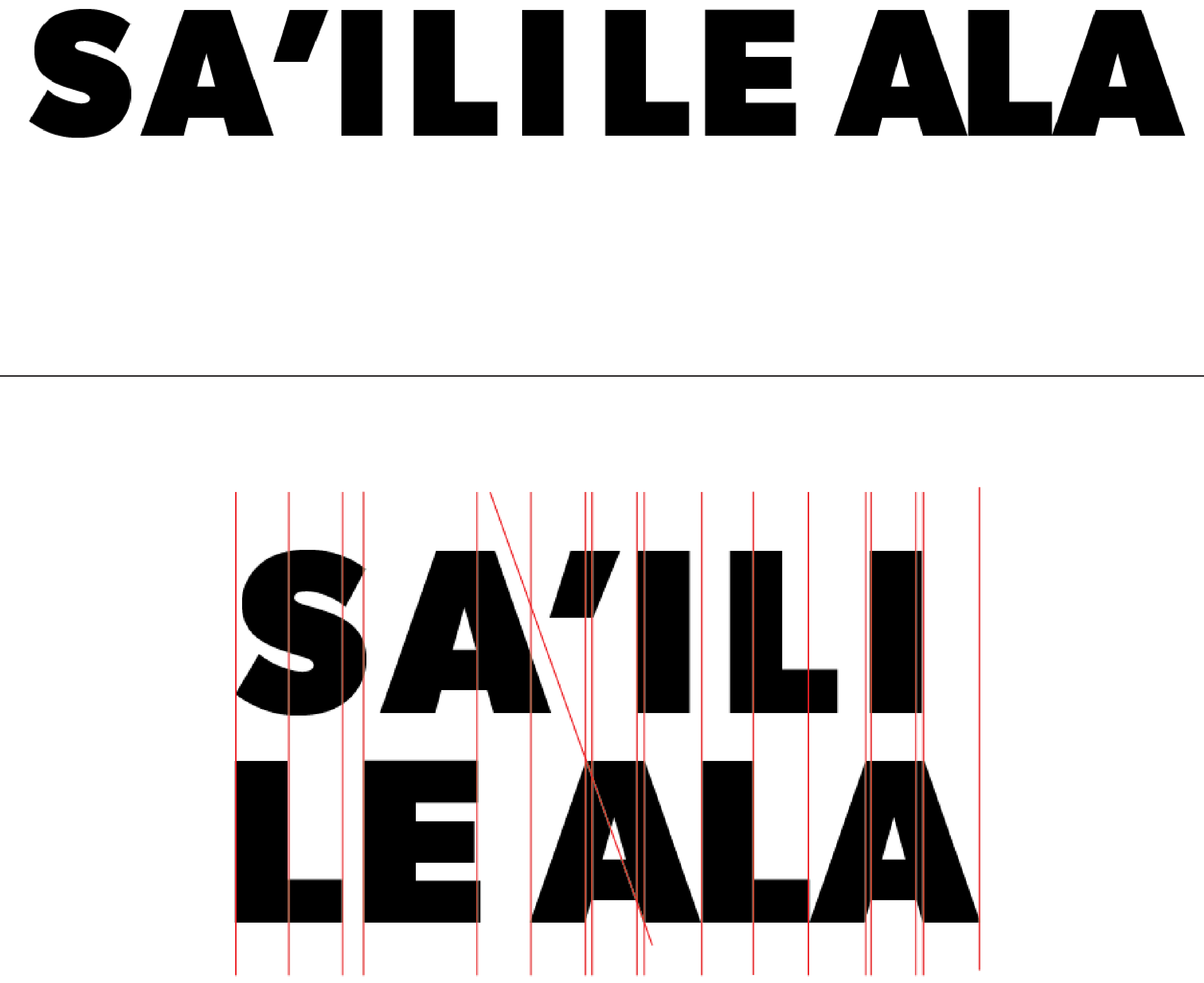
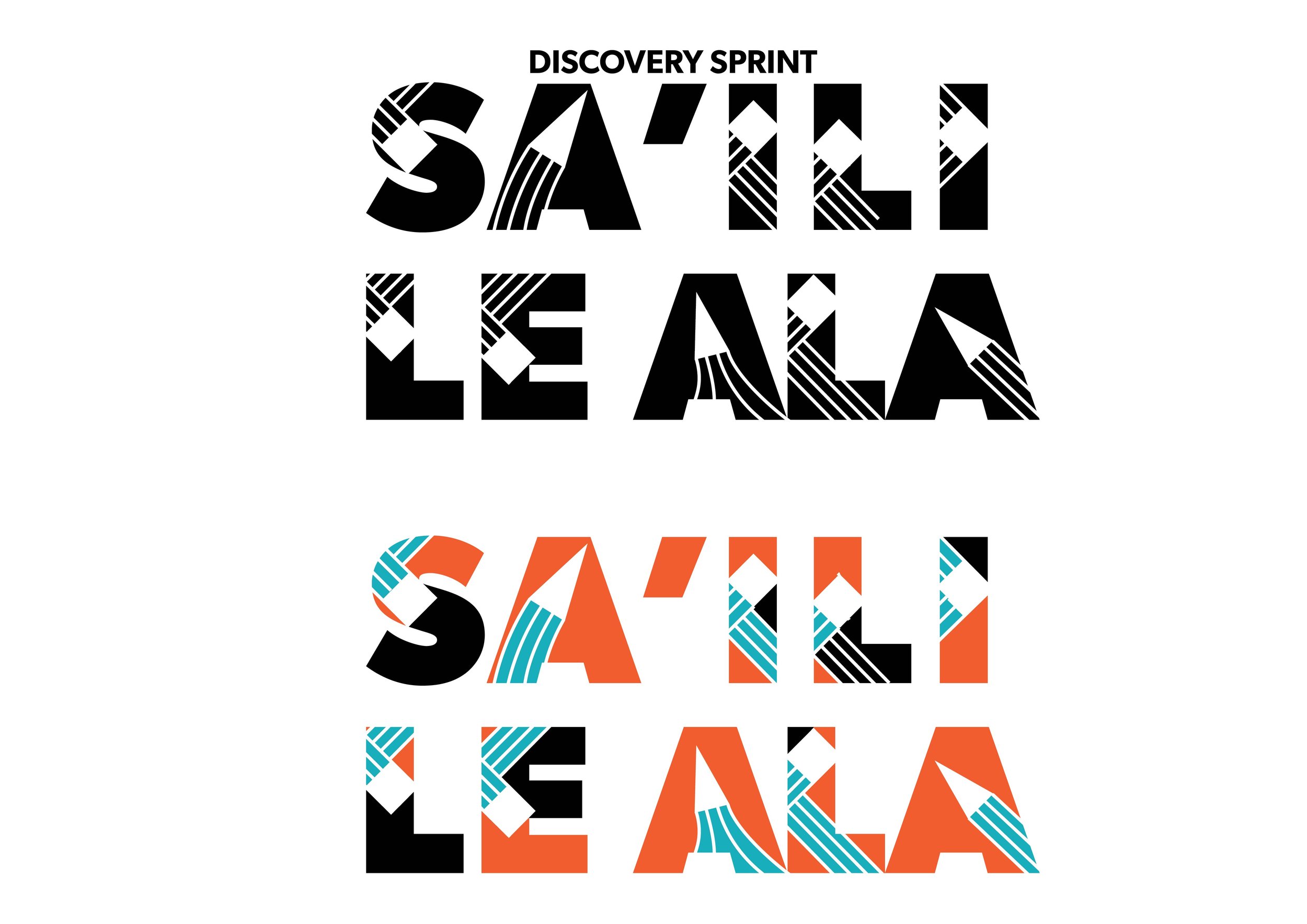
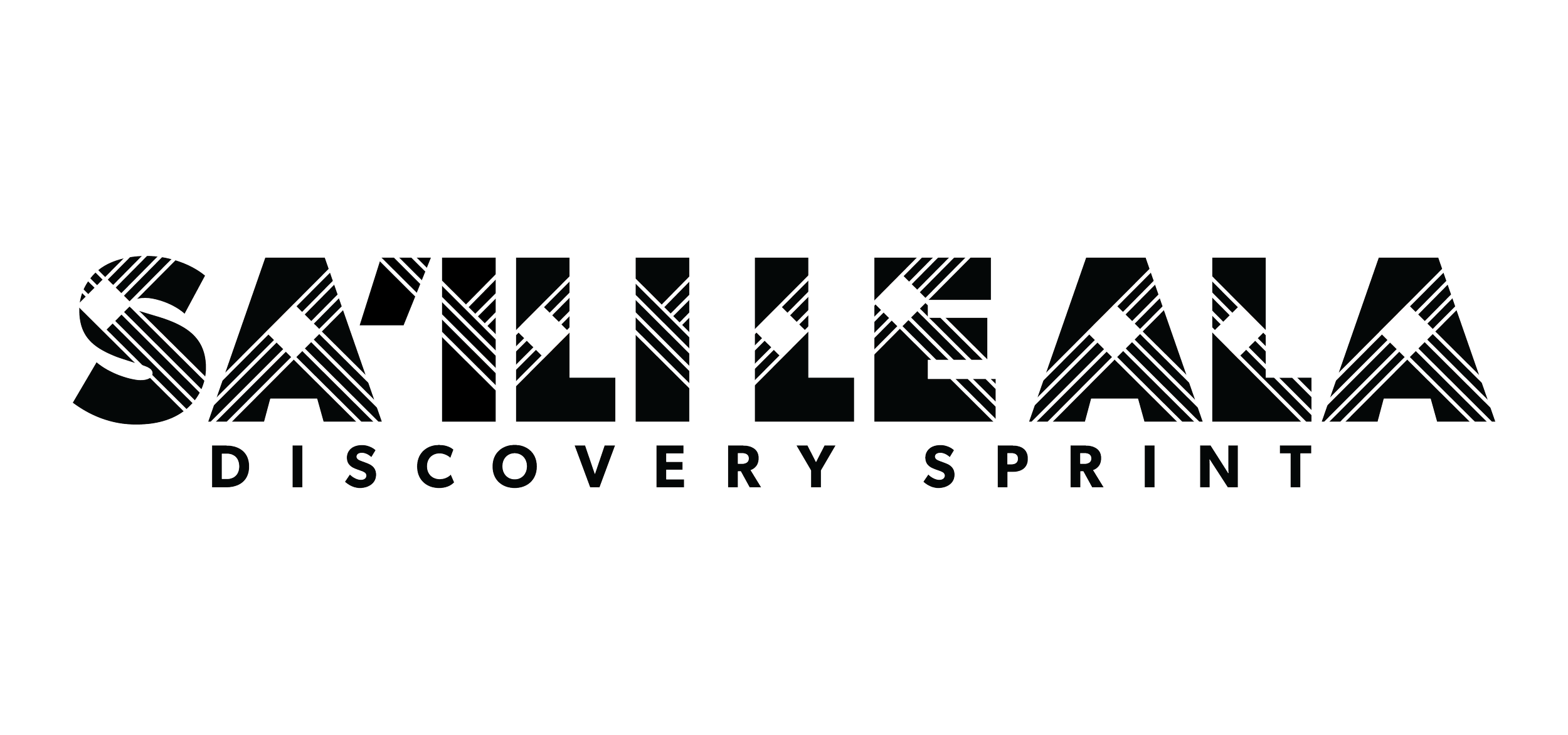
Typesetting a complex word
I used Illustrator to refine the
type-setting to create two
versions of the new identity.
Then focus on including the
visual language.
03
Exhibition Brand Identity
REFINEMENTS
Final Iterations
Create the Brand Identity for the Exhibition

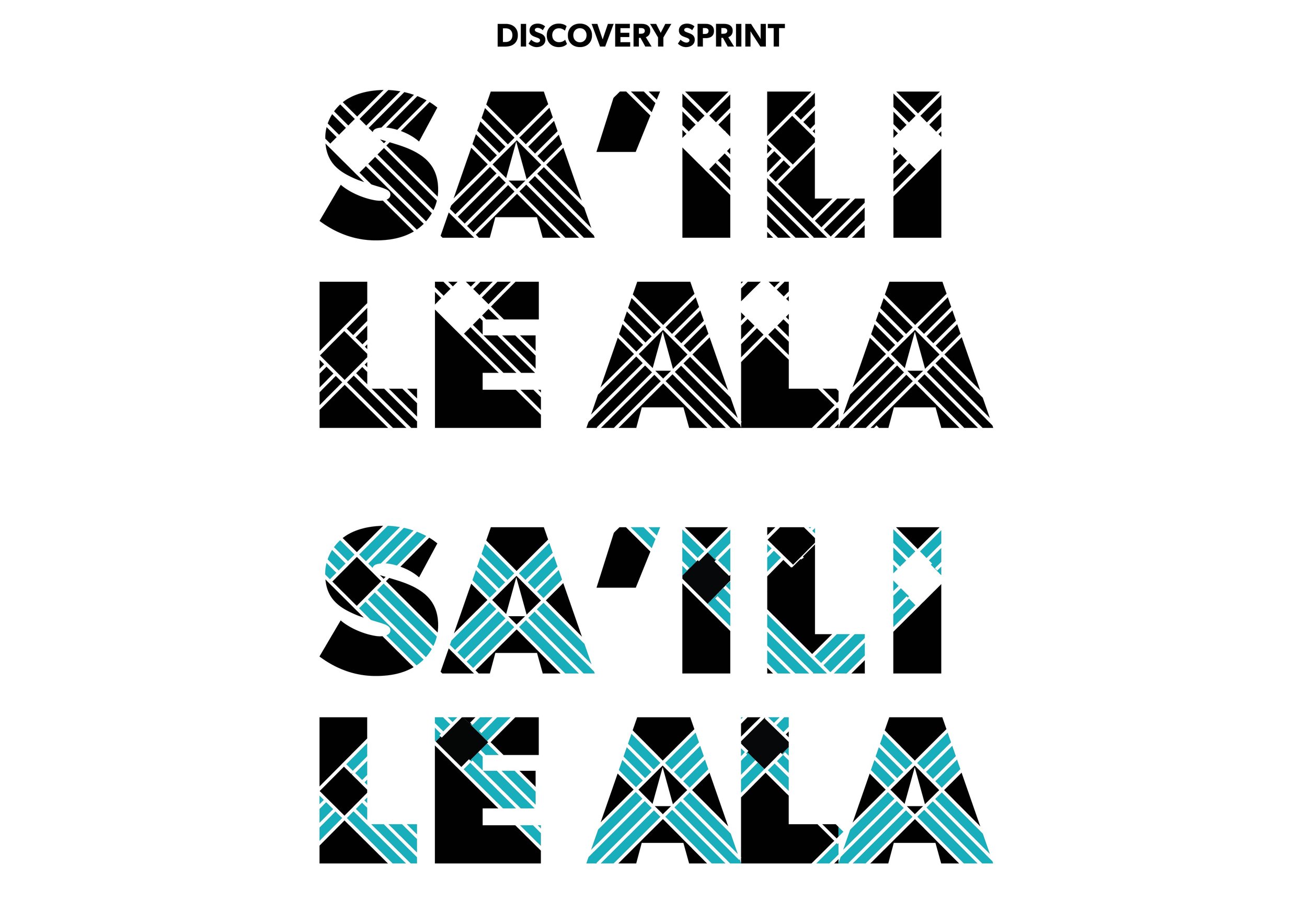
Iteration 1
VISUAL LANGUAGE
“Have you tried knocking out the middle of each letter?.”
Not enough fatigue
More landscape
Improve perspective
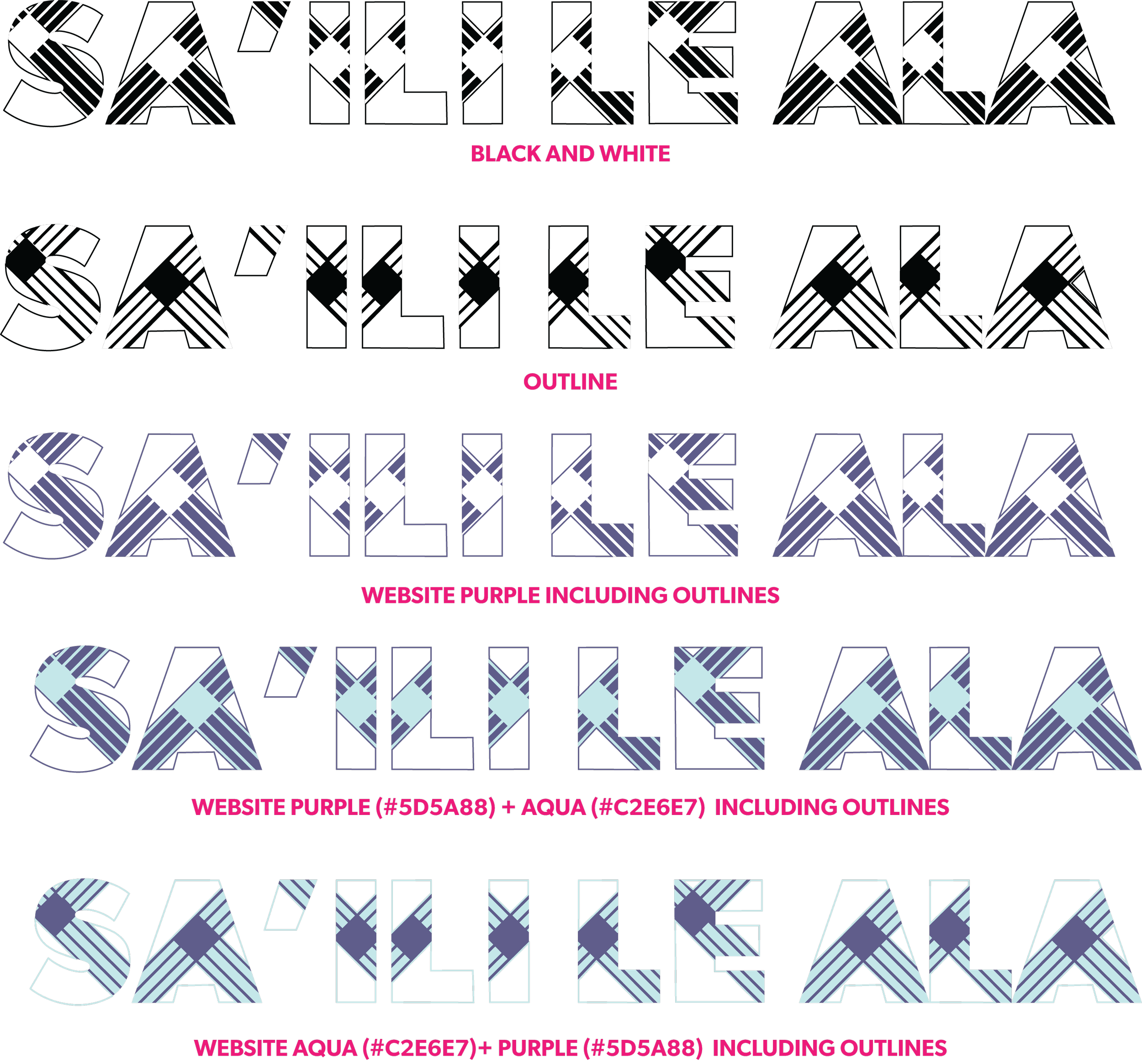
Iteration 2
NEGATIVE SPACE
“Own the space and add outlines”
Mask extending lines
Add color switch

Iteration 3
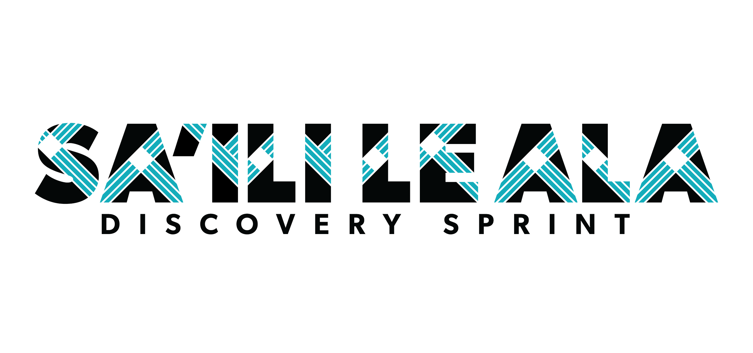
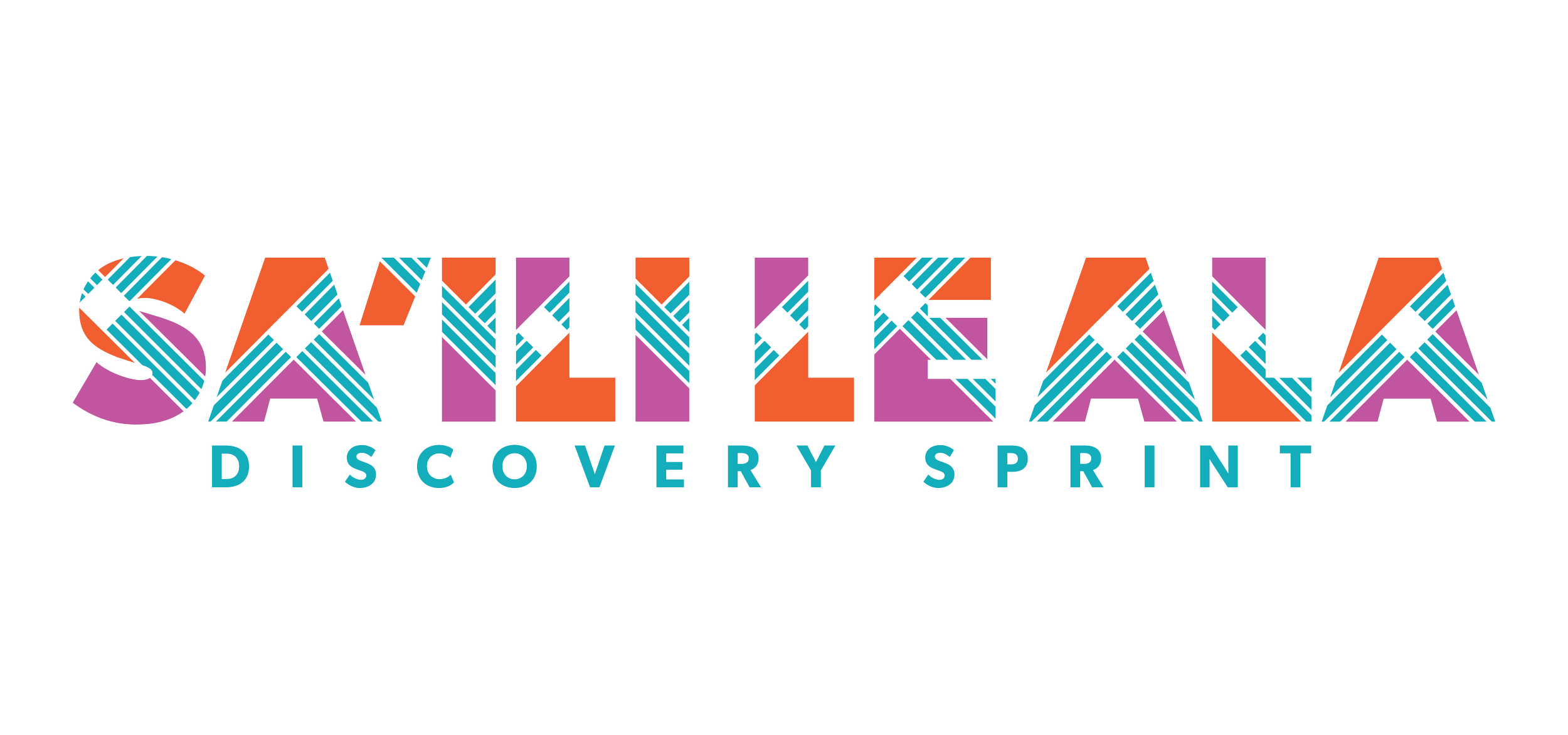
FINAL DESIGN
Flexible visual language
Pasifika identity

Old
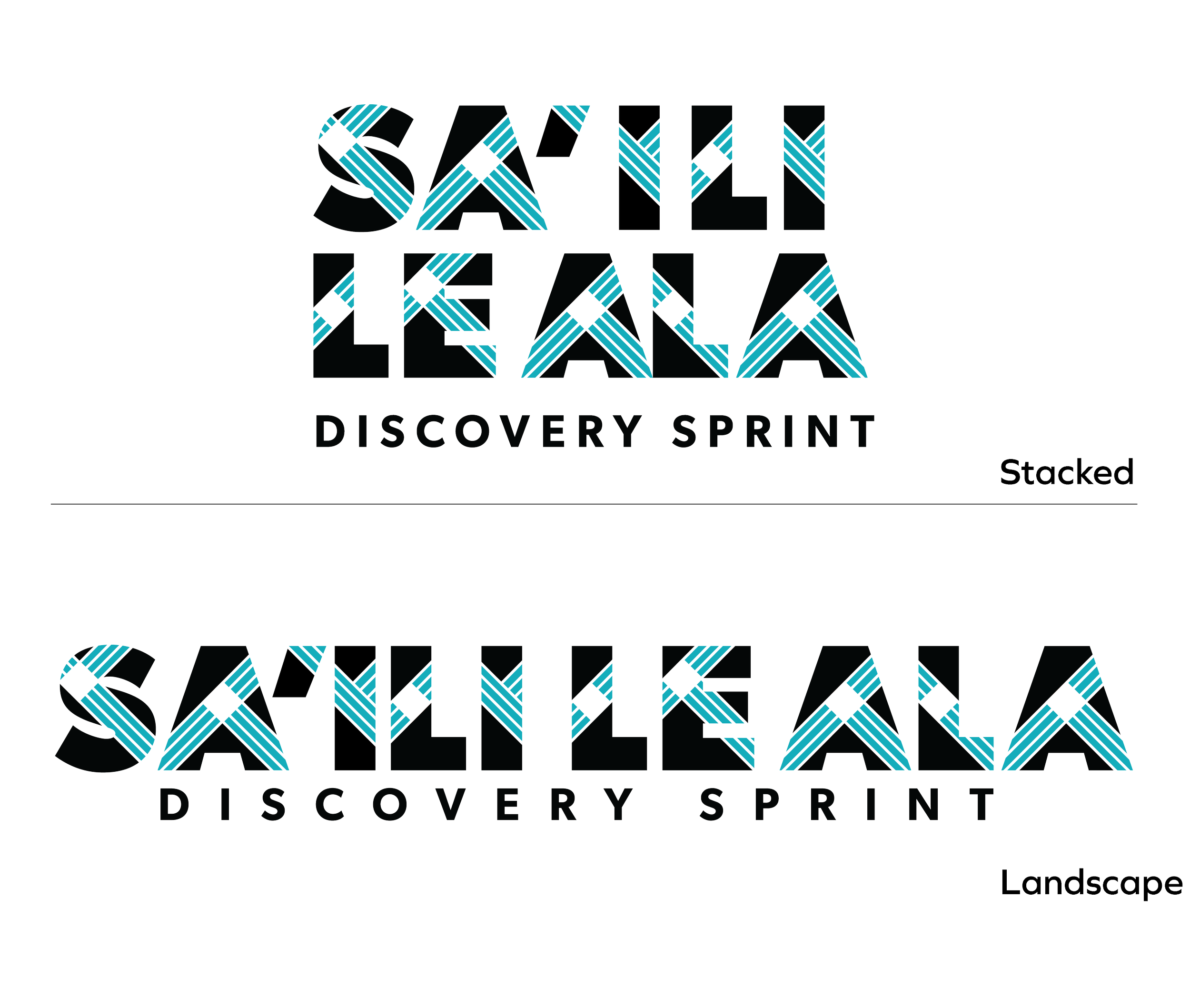
New
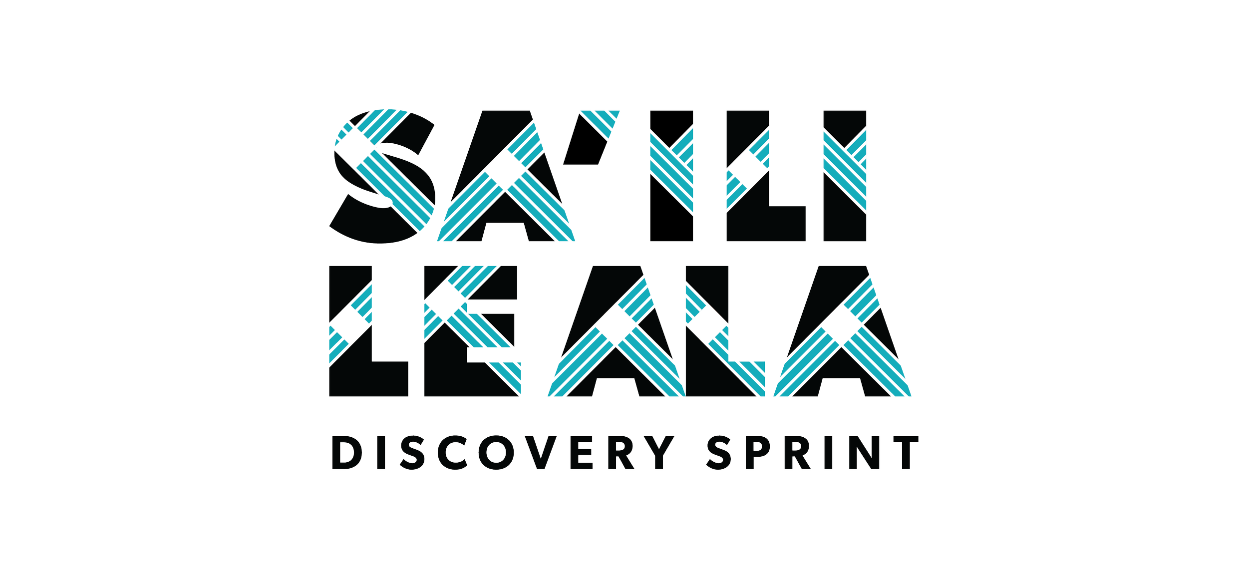
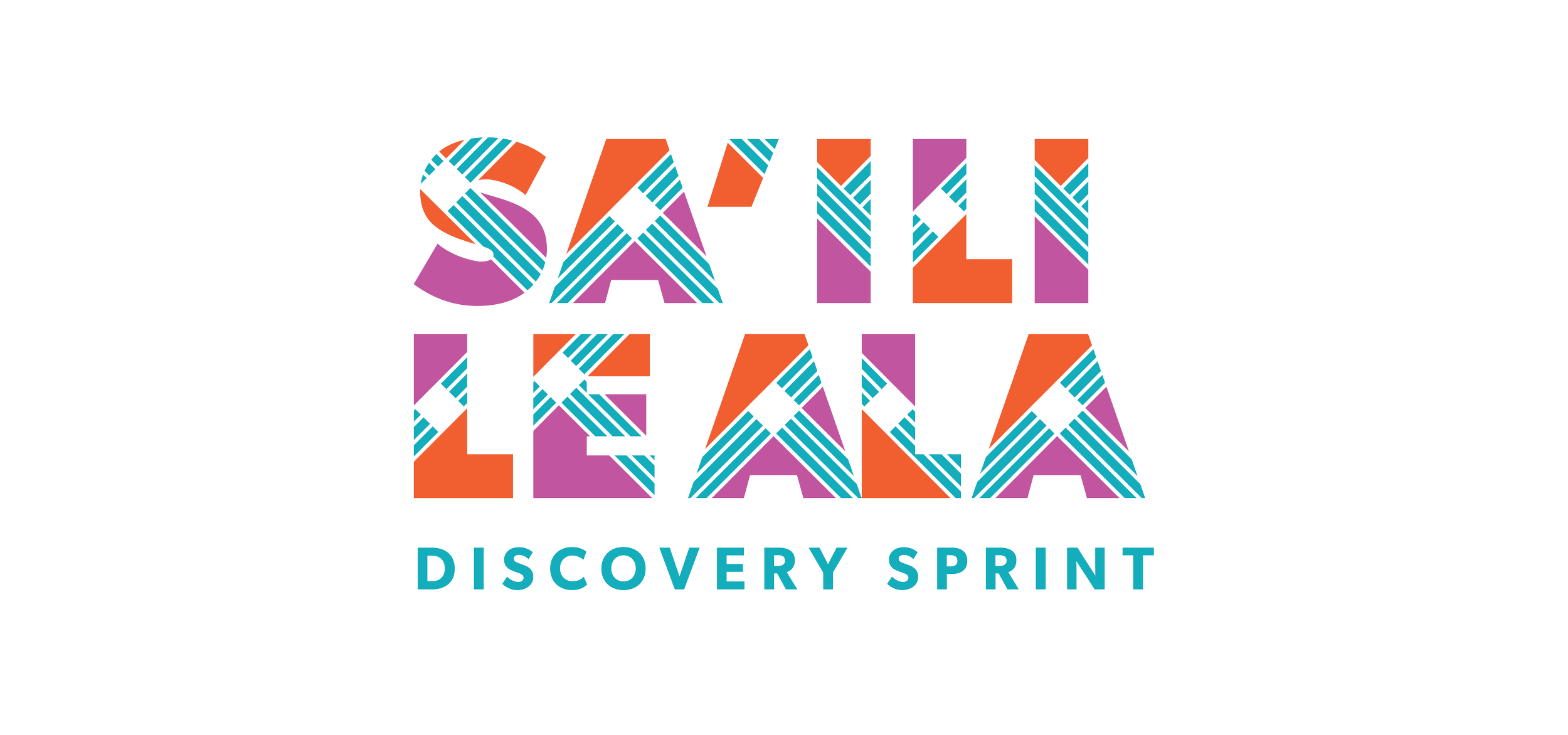
Light Sea Green
#11adba
Outrageous Orange
#f15f2f
Mulberry
#c156a0
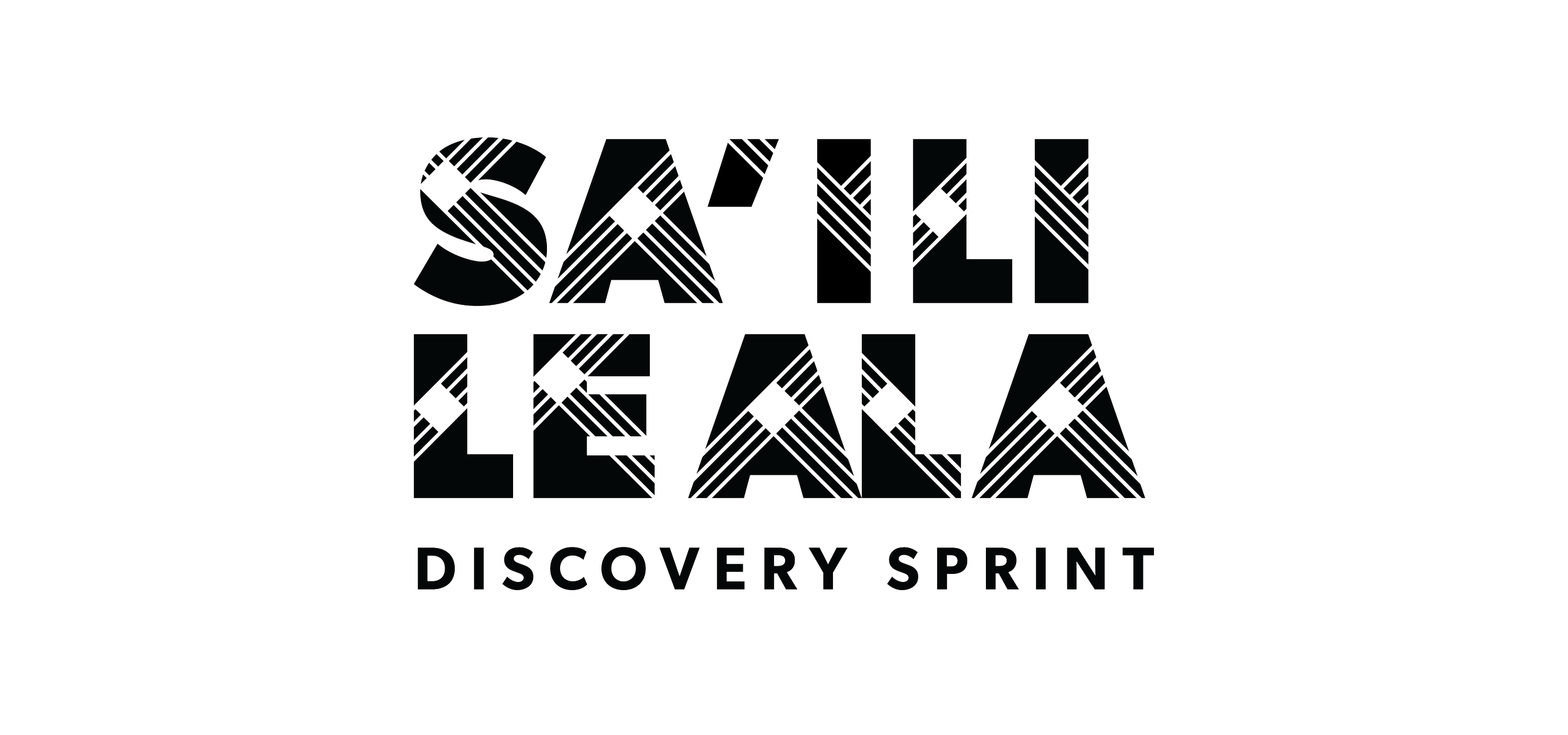
Black
#00000
White
#fffff

Halfway There
BRAND EXTENSIONS
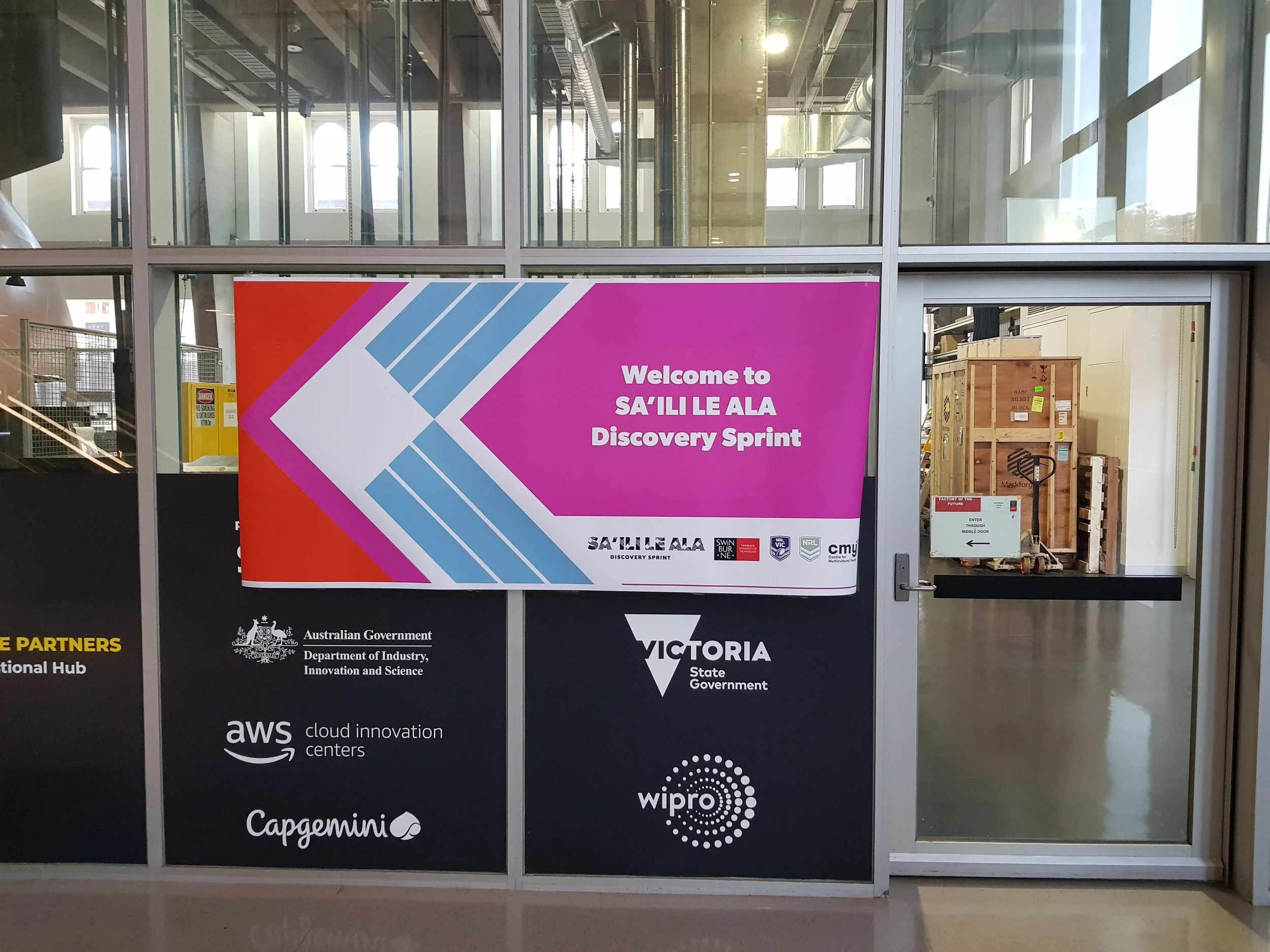
See how the brand was applied
onto the touchpoints at the
Discovery Sprints exhibition

Scroll Down
04
Brand Extensions
PRINT PRODUCTION
Tools
Tools
Apply Brand to Touchpoints
POSTER
DESIGN
Tools
Applying the visual Language
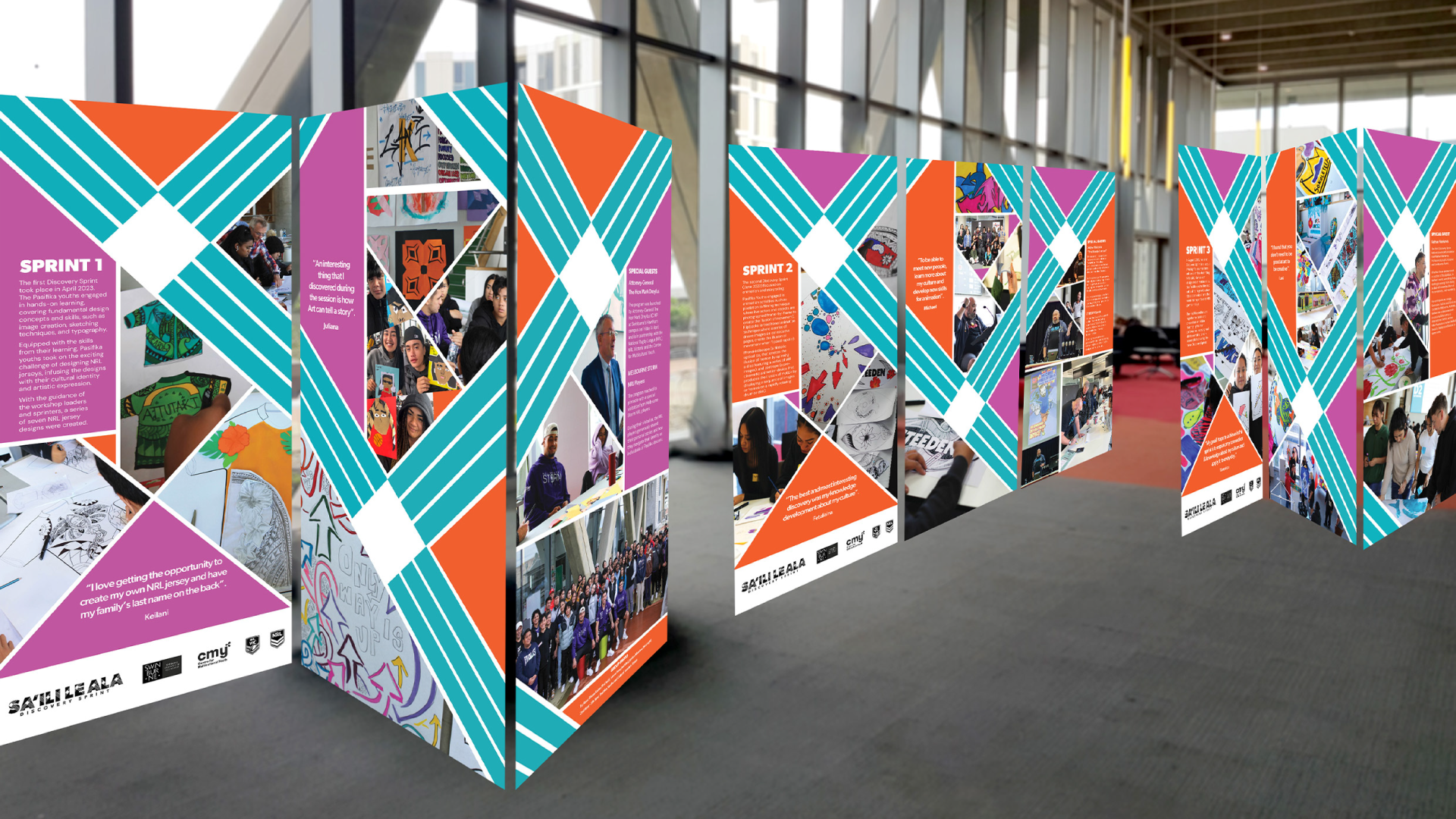
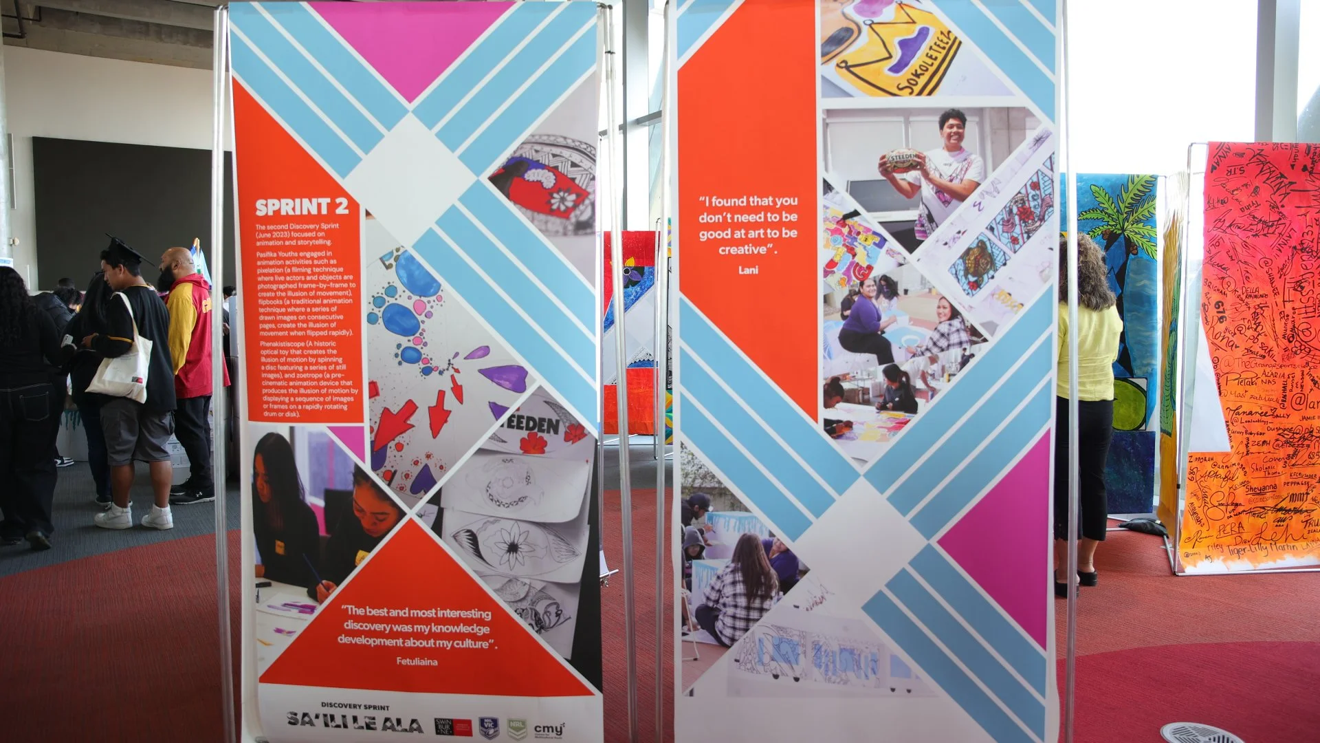
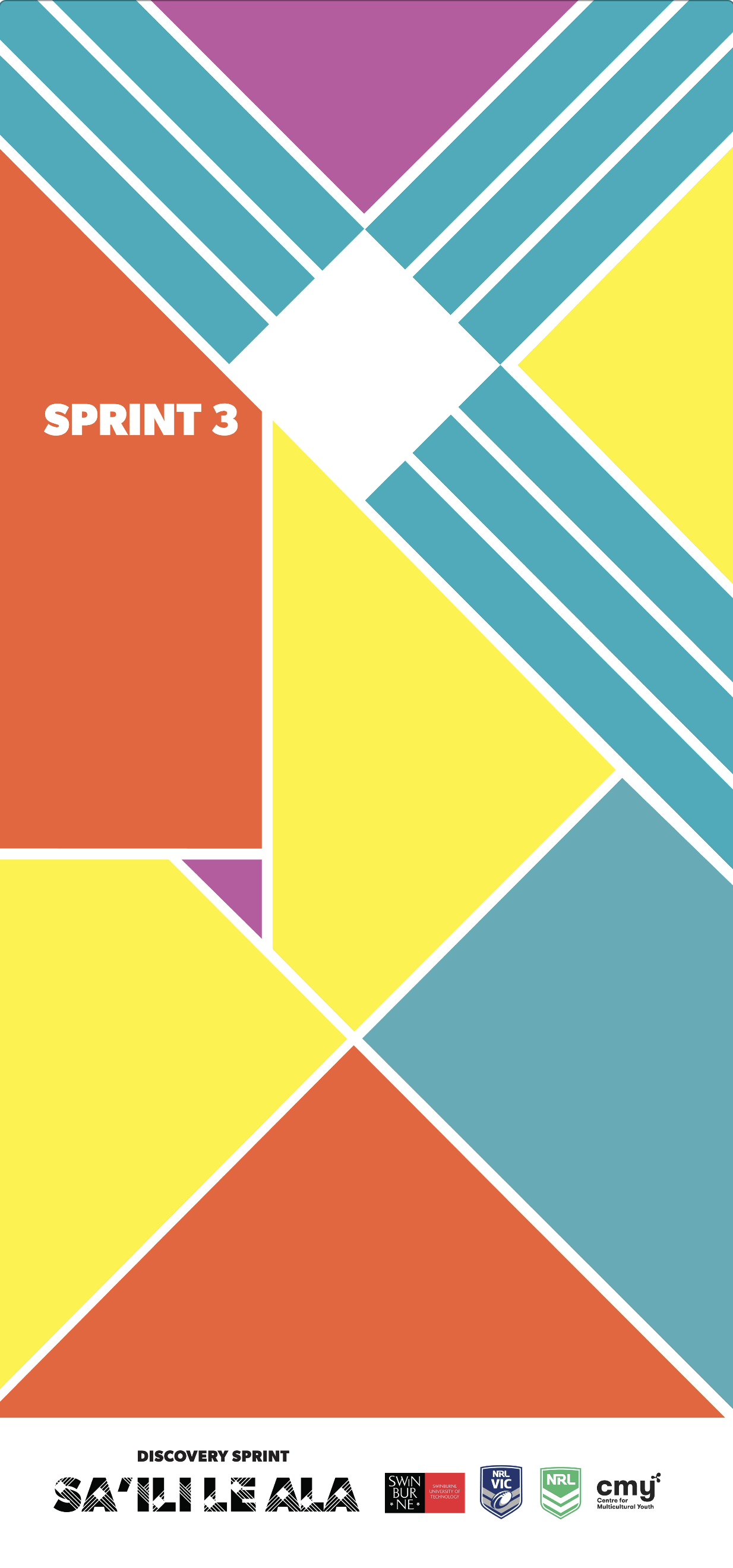
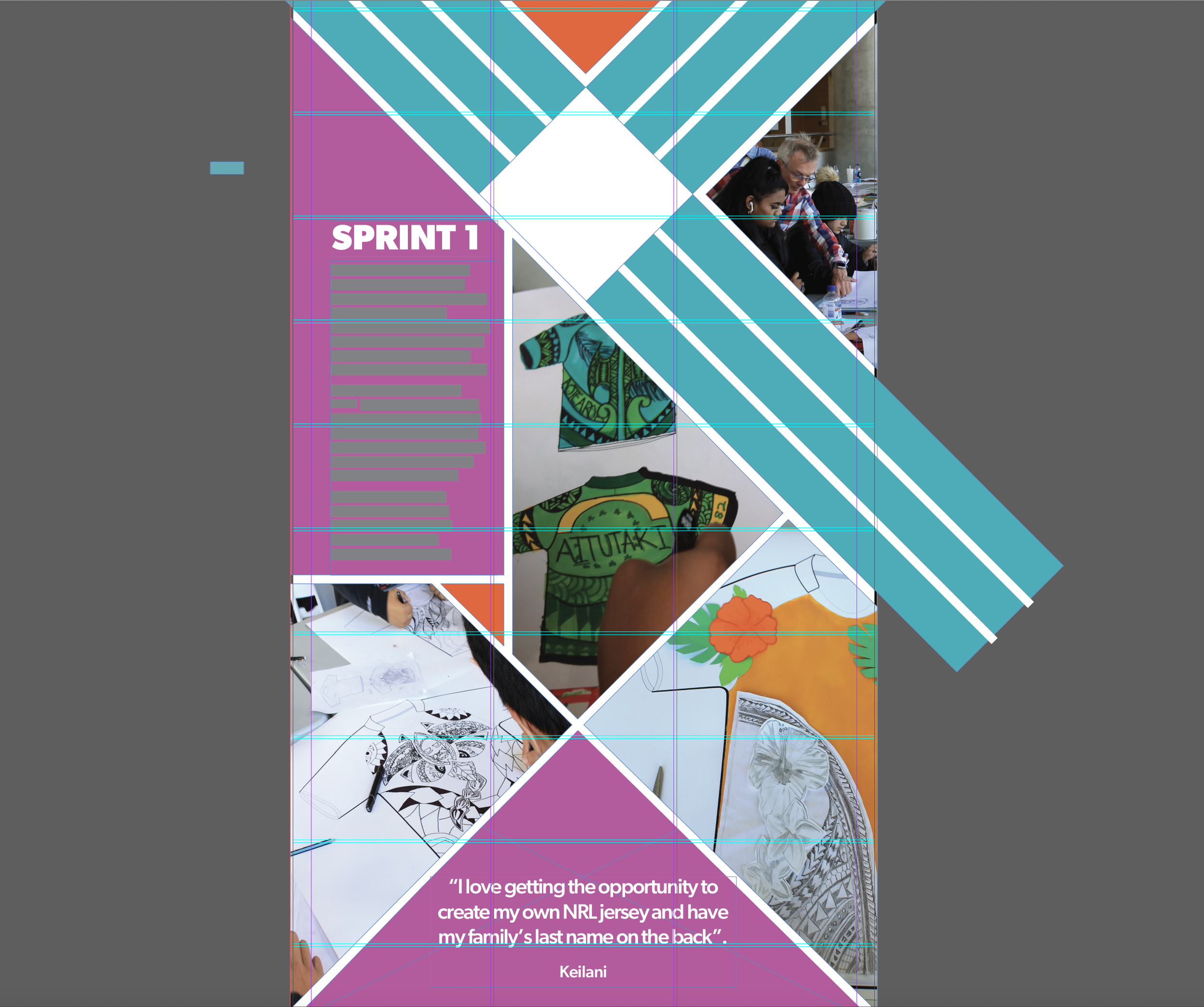
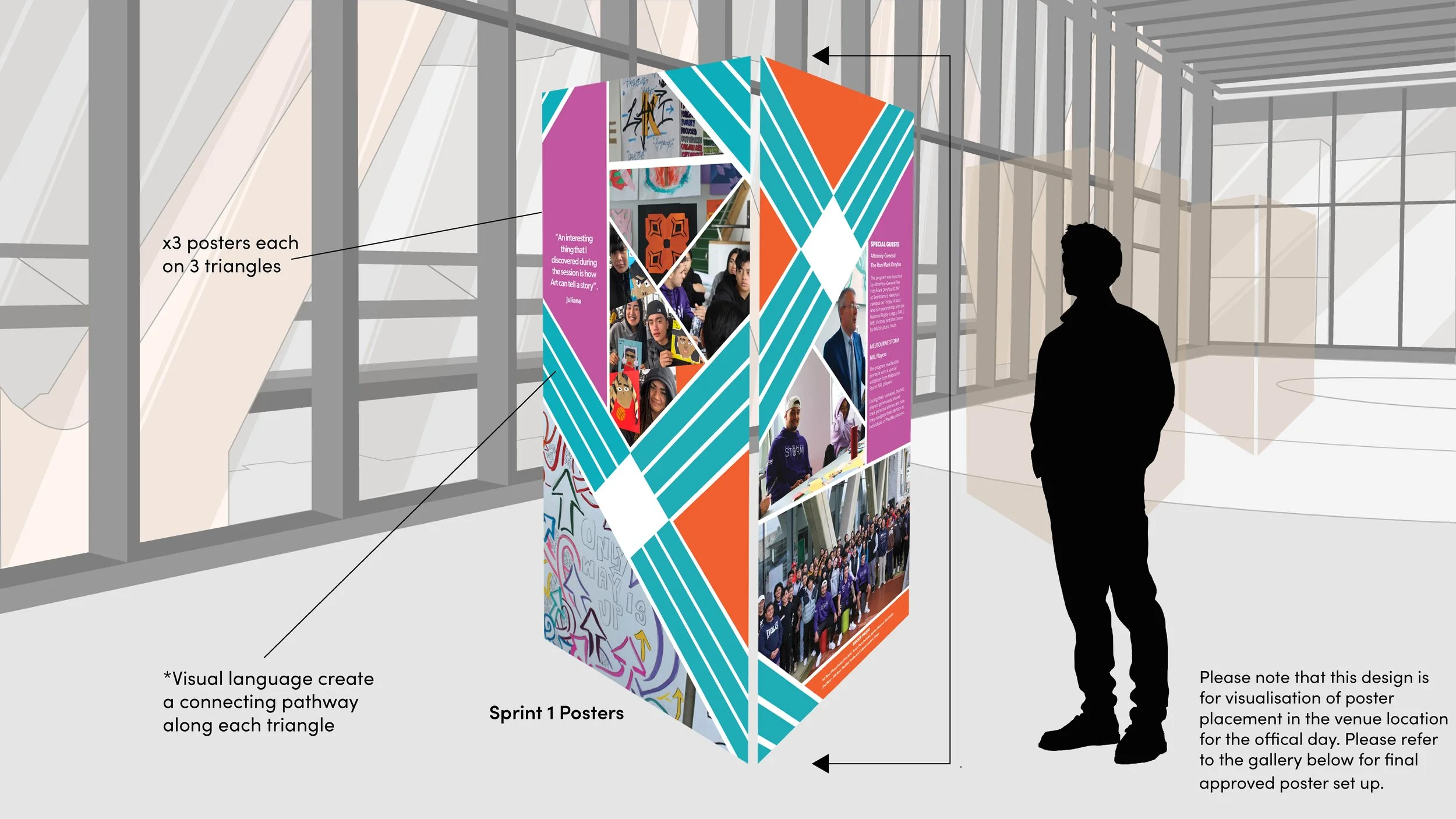
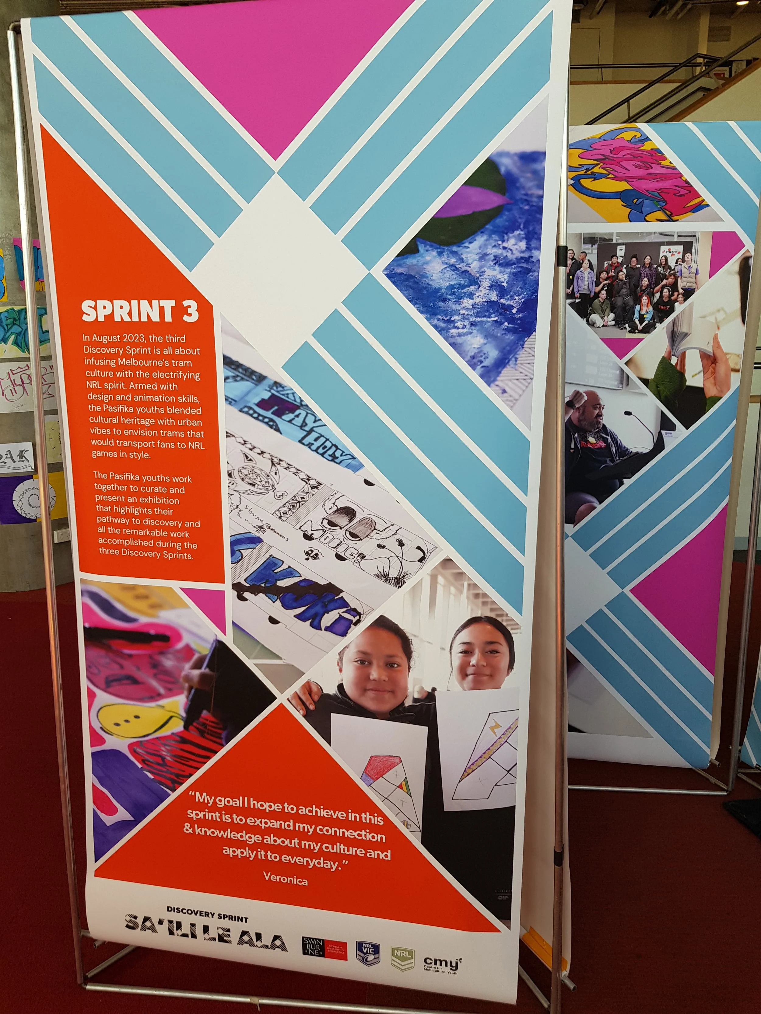
from the brand into 9 information poster templates that connect across three triangle facades that create a set of pathways.
Sprint program recap template

Light Sea Green
#11adba
Mulberry
#c156a0
Outrageous Orange
#f15f2f
Black
#00000
White
#fffff
05
The Exhibition
OUTCOME
Results of the Project
Create Cohesive Exhibition

CLIENT IMPACT
How I created value and impact
Increased
Viewership
In depth-viewing from target
audience, reading and viewing
information and posters.
Objective Complete

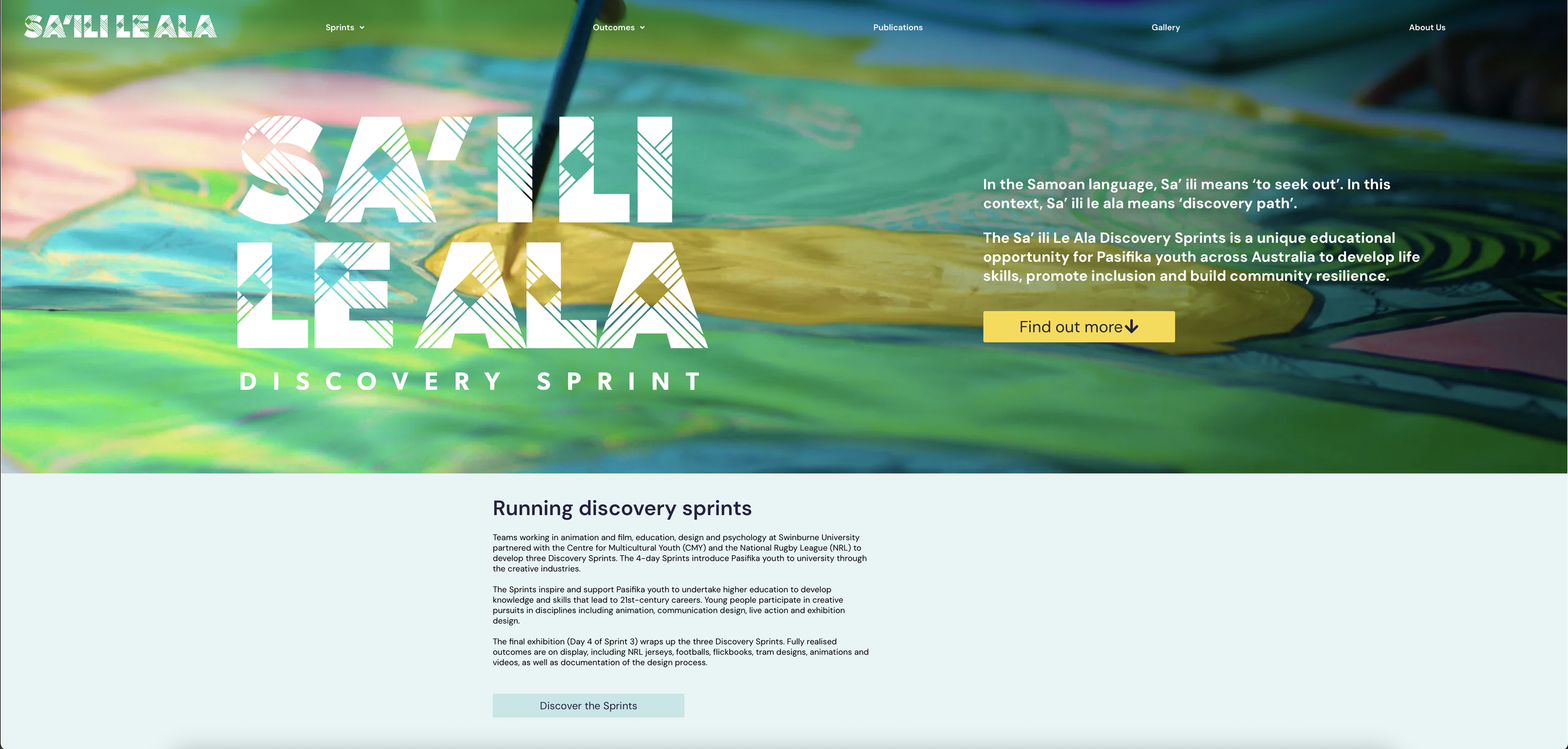
Brand
Application
Brand suite expanded visual identity featured on their website.
AWARDS
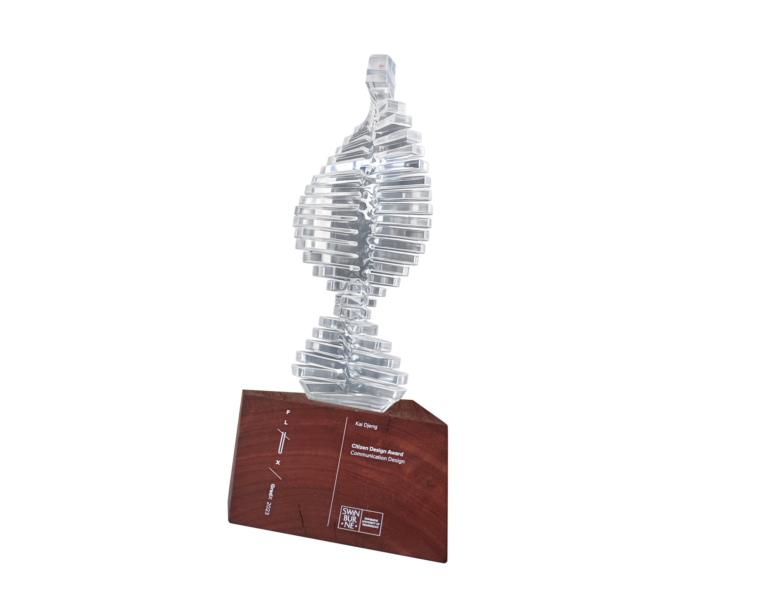
Citizen Design Award;
Communication Design
For work completed
in the Design Bureau and Discovery Sprints
EVIDENCE
Project 03 of 07
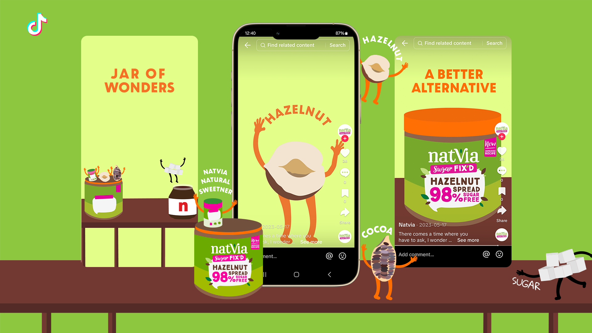
JAR OF WONDERS
Natvia connected with their audience on TikTok to help discover their hazelnut spread.

Project 04 of 06
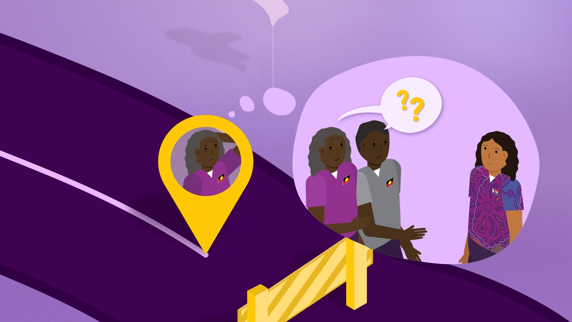
EQUITY IMPACT ASSESSMENTS
With a new service, Peter Mac set out to drive awareness for their staff to create equitable care.
Project 05 of 06
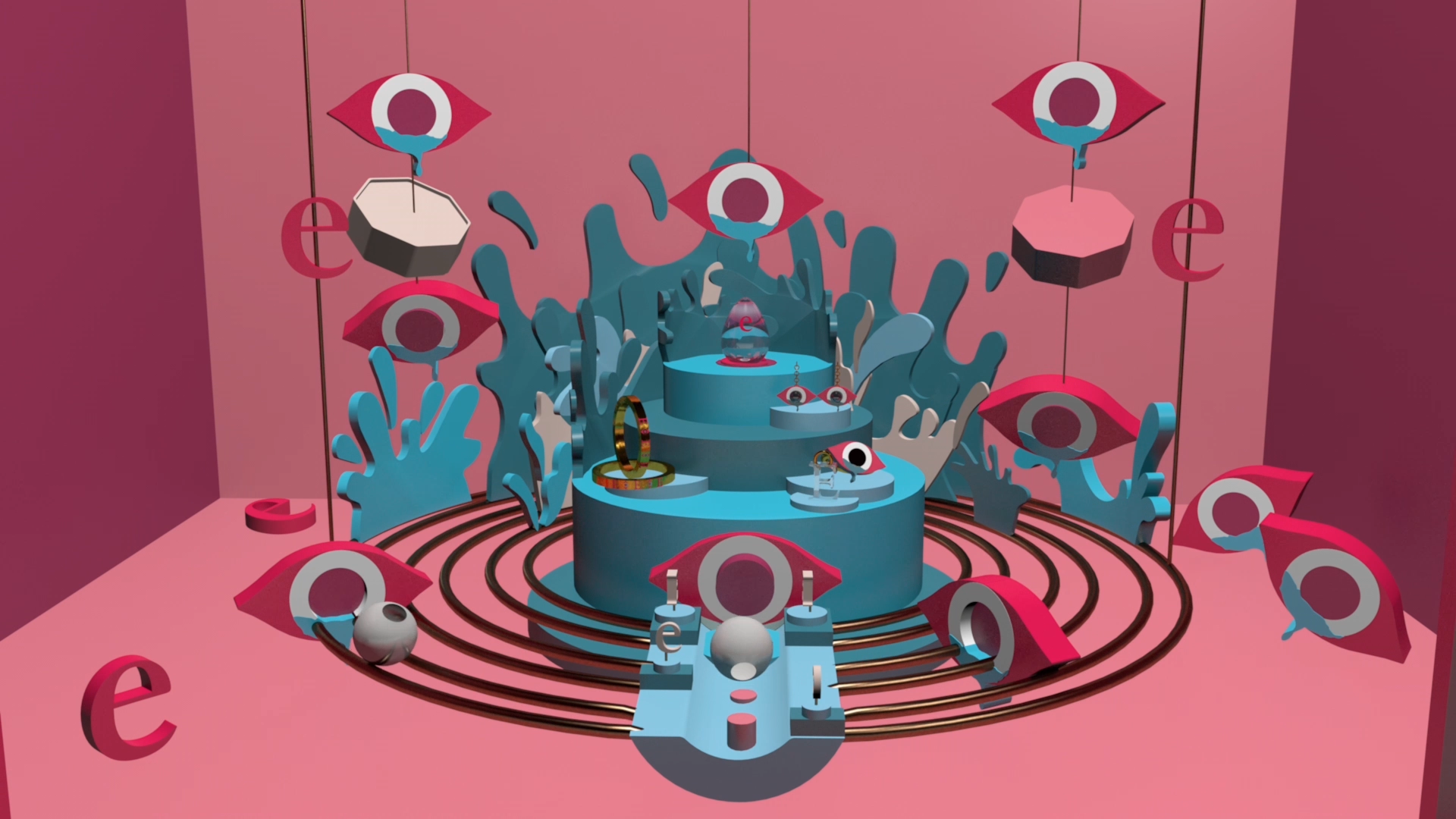
EYE WATERING COLLECTION
Launch of a new jewellery collection, brought to you by E.
Project 06 of 06
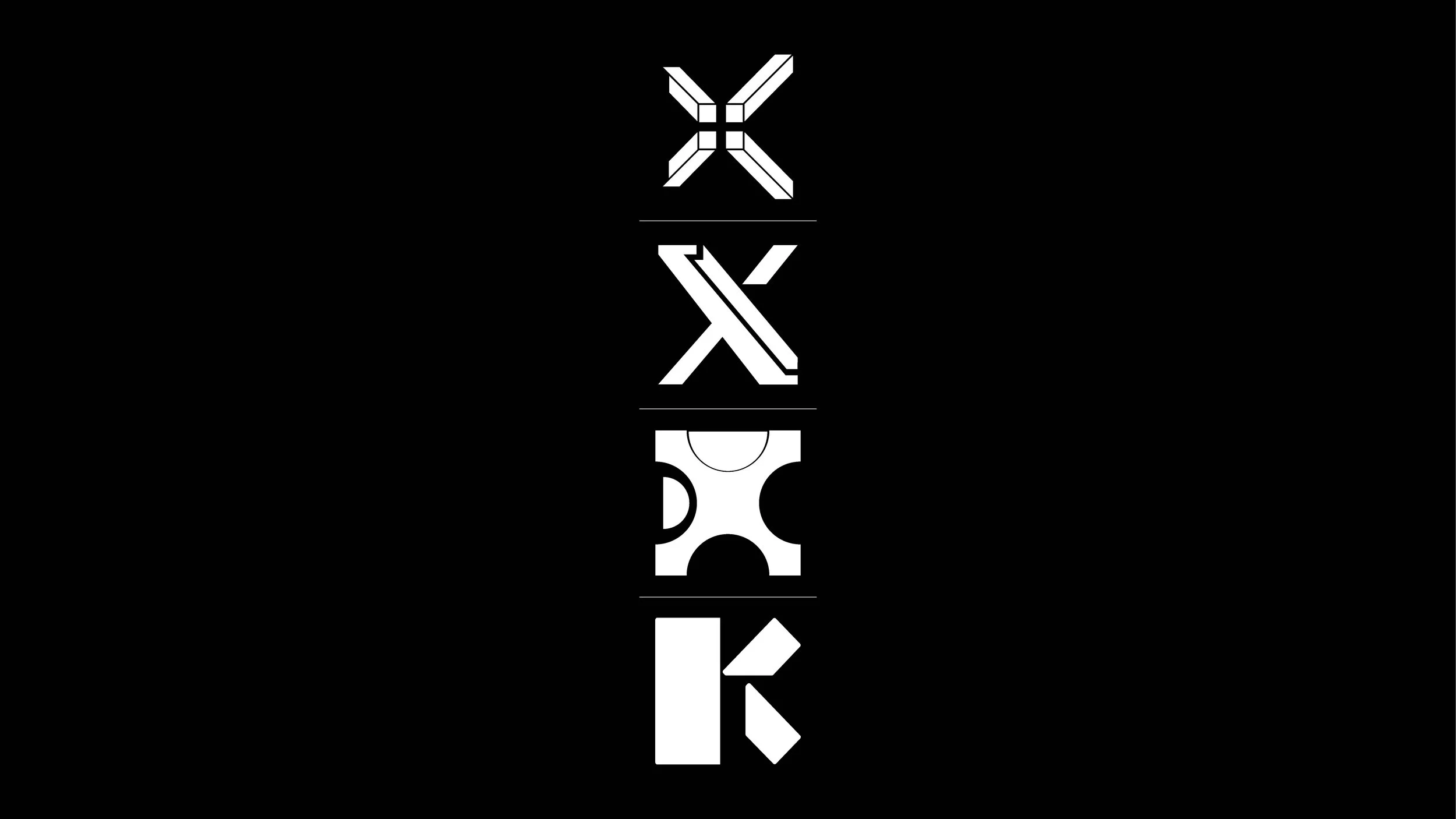
GRADX EXHIBITION
Design Bureau set out to create a cohesive brand experience for the opening night of Swinburne design graduate exhibition.
Project 01 of 06
TOOLBOX TALKS
Animated content for campaign to raise awareness and up-skill heavy vehicle driver performance on the road.